What’s wrong with Quora?
![]() You might be asking, “What is Quora?” We’ll get into that soon enough. Let’s explore the problems with Quora.
You might be asking, “What is Quora?” We’ll get into that soon enough. Let’s explore the problems with Quora.
Questions and Answers
Before we get into Quora, let’s start by talking about Google. Many people seek answers from Google for many different questions. In fact, questions are the number one use for Google. You don’t go to Google to seek answers you already know. You go there to search (or question) things you don’t know. Such questions might include:
- Where can I buy a toaster?
- How long do I bake a chicken?
- How do I make Quesadillas?
- What’s the value of my 1974 Pontiac T-Bird?
These are full text questions. And yes, Google does support asking questions in long form such as these above. You can also search Google by using short key words, such as “toastmaster toaster” or “pontiac t-bird” (no, you don’t even need to use the proper case).
These short form questions are solely for use at search engines. When seeking answers to long form questions both Google and other sites can offer responses to your questions. One such site is Quora. Another is Yahoo Answers (a much older platform). Even Google got in on this action with Google Questions and Answers.
Quora
Quora is a recent incarnation of the older Yahoo Answers platform. Even before Yahoo Answers, there was Ask Jeeves. Even Epinions, a product review site (defunct as of 2018), had many answers to many questions. Epinions, in fact, opens a bigger discussion around site closures and content… but that’s a discussion for another article.
The real question (ahem) is whether sites like Yahoo Answers and Quora provide valuable answers or whether they simply usurp Google’s ability to answer questions in more trusted ways. I’m on the fence as to this question’s answer. Let me explain more about Quora to understand why I feel this way.
Quora is a crowdsourced product. By that I mean that both questions and answers are driven by crowds of subscribers. Not by Quora staff or, indeed, Quora at all. Unlike Wikipedia which has many volunteers who constantly proof, correct and improve articles to make Wikipedia a trustworthy information source, Quora offers nothing but the weakest of moderation. In fact, the only moderation Quora offers is both removal of answers and banning of accounts.
Quora has no live people out there reviewing questions and answers for either grammar and mechanics, nor trustworthiness. No one questions whether an answer is valid, useful or indeed even correct. Quora doesn’t even require its answer authors to cite sources or in any way validate what they have written. In fact, Quora’s moderation system is so broken that when answer authors do cite sources, their answer might be flagged and removed as ‘spam’. Yes, the very inclusion of web site links can and will cause answers to be marked as spam and removed from the site. Quora’s insane rationale is that if there’s a web link, it must be pointing to a site owned by the answer author and in which the answer author is attempting to advertise. This stupid and undermining rationale is applied by bots who neither read the content they review nor do they understand that the answer author can’t possibly own Wikipedia.com, Amazon.com or eBay.com.
Indeed, Quora’s moderation is so bare bones basic and broken, it undermines Quora’s own trustworthiness so much so that when you read an answer on Quora, you must always question the answer author’s reputation. Even then, because Quora’s verification and reputation system is non-existent, you can never know if the person is who they say they are. But, this is just the tip of the troubles at Quora.
Quora’s Real Problems
Trustworthiness is something every information site must address. It must address it in concrete and useful ways, ways that subscribers can easily get really fast. Wikipedia has addressed its trust issues by a fleet of moderators who constantly comb Wikipedia and who question every article and every statement in each article. Even with a fleet of moderators, incorrect information can creep in. Within a day or two, that information will either be corrected or removed. Wikipedia has very stringent rules around the addition and verification of information.
Twitter (prior to Musk having bought it) offered a verification system so that celebrities and people of note could send information to Twitter to verify who they say they are to Twitter’s staff. You’ll notice these as little blue check mark’s by the Twitter subscriber’s name. These check marks validate the person as legitimate and not a fake. HOWEVER … After Musk’s takeover of Twitter => X, the blue check has become nothing more than a useless symbol that someone paid a few bucks to X. The former trust that the blue check mark offered prior to Musk became entirely worthless after anyone could buy it with no verification.
Quora, on the other hand, has no such rules or validation systems at all. In fact, Quora’s terms of service are all primarily designed around “behaving nicely” with no rules around validation of content or of authors. Indeed, Quora offers no terms that address trust or truth of the information provided. Far too many times, authors use Quora as a way of writing fanciful fiction. Worse, Quora does nothing to address this problem. They’re too worried about “spam” links than about whether an answer to a question is valid or trustworthy.
Yet, Quora continually usurps Google’s search by placing its questions (and answers implicitly) at the top of the search results. I question the value in Quora for this. It’s fine if Quora’s answers appear in search towards the bottom of the page, but they should NEVER appear at the number 1 position. This is primarily a Google problem. That Google chooses to promote untrustworthy sites at the top of its search results is something that Google most definitely needs to address. Sure, it is a problem for Quora, but it’s likewise a problem for Google.
Google purports to want to maintain “safety” and “trustworthiness” in its search by not leading you to malicious sites and by, instead, leading you to trustworthy sites. Yet, it plops Quora’s sometimes malicious answers at the top of its search results. Google needs to begin rating sites for trustworthiness and it should then push search results to appropriate levels based on that level of trust. Google needs to insist that sites like Quora, which provide consumers with actionable information, must maintain a certain level of trust to maintain high search rankings. Quora having its question results appear in the top 3 positions of the first page of Google search based entirely on weak trustworthiness is completely problematic.
Wikipedia strives to make its site trustworthy… that what you read is, indeed, valuable, valid and truthful information. Quora, on the other hand, makes absolutely no effort to ensure its answers are valid, trustworthy or, indeed, even truthful. You could ask Google for the answer to a question. You might see Quora’s results at the top of Google’s results and click it. Google placing such sites in the top 3 positions implies an automatic level of trust. That the sites that appear in the first 3 results are there because they ARE trustworthy. This implicit trust is entirely misplaced. Google doesn’t, in fact, place sites in the top of its search because they are trustworthy. It places them there because of “popularity”.
You simply can’t jump to this “trustworthiness” conclusion when viewing Google search results. The only thing you can glean from a site appearing in Google results is that it is not going to infect your computer with a virus. Otherwise, Google places any site at the top of its ranking when Google decides to rank in that position. As I said, you should never read any implicit level of trust into sites which appear in the first 3 positions of Google search. Quora proves this out. Quora’s entire lack of trustworthiness of information means that Google is not, in any way, looking out for your best interests. They are looking out for Quora, not you. Quora’s questions sometimes even rank higher than Wikipedia.
Google and AI results
This section has been added in 2025 with new information regarding changes with Google Search. Google formerly relied heavily on Quora for questions and answers, because Google’s own answer site didn’t stack up. With the recent introduction of AI answers at the top of Google’s search results, Google has now pushed Quora out as a useful answer for most searches. Much of what was stated involving Google and Quora within this article has now substantially changed for Quora. No longer are Quora answers being promoted to the top of Google’s search. That spot has been replaced by Google’s AI answers system. That Quora has gotten bumped out of Google is a good thing. Unfortunately, what replaced it isn’t a good thing, at least not yet.
So, be careful. Google’s AI answers are likely to be even more untrustworthy and incorrect than Quora’s answers. Google’s AI answers are speculated to offer wrong information as much as 60% of the time.
Recent studies and user experiences indicate that Google’s AI Overviews can be wrong quite frequently. A study by the Columbia Journalism Review found that AI search tools, including Google’s, provided incorrect answers to over 60% of queries. Google acknowledges these errors and has even admitted to past mistakes, particularly in the early stages of AI Overviews. While Google is working to improve its AI, users should be aware of the potential for inaccuracies, especially with uncommon or complex queries.
Be cautious when relying on Google’s AI answers, but also be just as cautious when reading Quora’s answers. However, because Quora’s answers are more likely to be handwritten by human authors, those answers may end up correct more often than 60% of the time. Though, answer authors can now use AI systems like ChatGPT to craft their answers for Quora. Again, remain cautious. Now back to the regularly scheduled original article.
Quora’s Answers
With that said, let’s delve deeper into the problem with Quora’s answers. If you’ve ever written an answer on Quora, then you’ll fully understand what I’m about to say. Quora’s terms of service are, in fact, counter to producing trustworthy answers. Unlike news sites like CNN, The Washington Post and the L.A. Times, where journalistic integrity is the key driving force, Quora ensures none of this. Sure, Quora’s answer editor tool does offer the ability to insert quotes and references, but doing so can easily mark your answer as ‘spam’.
In fact, I’ve had 2 or 3 year old Quora answers marked as ‘spam’ and removed from view because of the inclusion of a link to an external and reputable web site. Quora cites violation of terms for this when, in fact, no such violation exists. The author is then required to spend time appealing this “decision”.
Instead, its bots will remove reviews from its site based entirely upon reports by users. If a user doesn’t like the answer, they can report the answer and a Quora review bot will then take the answer down and place it under moderation appeal. There is no manual review by actual Quora staff to check the bot’s work. This work is all done by robots. Robots that can be gamed and sabotaged by irate, irrational, upset users who have a vendetta against other Quorans.
The answer takedowns are never in the interest of trust or making Quora more trustworthy, but are always in the interest of siding with the reporting user who has a vendetta or is simply insane. Users have even learned that they can game Quora’s robots to have answers removed without valid reasons or, indeed, no reasons at all. There’s no check and balance with the moderation robots or takedown requests. Quora receives a report, the answer is summarily removed.
Unfortunately, this is the tip of a much larger Quora iceberg. Let’s continue.
Which is more important, the question or the answer?
All of the above leads to an even bigger problem. Instead of Quora spending its development time attempting to shore up its level of site trust, it instead spends its time creating questionable programs like the Partner Program. A program that, in one idea, sums up everything wrong with Quora.
What is the Partner Program? I’ll get to that in a moment. What the Partner Program ultimately is to Quora is an albatross. Or, more specifically, it will likely become Quora’s downfall. This program solidifies everything I’ve said above and, simultaneously, illustrates Quora’s lack of understanding of its very own platform. Quora doesn’t “get” why a question and answer platform is important.
Which is more important to Quora? They answered this question (ha, see what I did there?) by making the question more important than the answer.
That’s right. The Partner Program rewards people monetarily who ask questions, NOT by rewarding the people who spend the lion’s share of their time writing thoughtful, truthful, trustworthy answers. In effect, Quora has told answer authors that their answers don’t matter. You can write a two sentence answer and it would make no difference. Yes, let’s reward the people who spend 5 minutes writing a 5-10 word sentence… not the people who spend an hour or two crafting trustworthy answers. And this is Quora’s problem in a nutshell.
Worse, it’s not the questions that draw people in to Quora. Yes, the question may be the ‘search terms’, but it’s not why people end up on Quora. The question leads people in, it’s the ANSWER that keeps them there. It’s the answers that people spend their time reading, not the questions.
This is the iceberg that Quora doesn’t get nor do they even understand. The questions are stubs. The questions are merely the arrow pointing the way. It’s not the end, it’s the beginning. The questions are not the reason people visit Quora.
By producing the Partner Program, Quora has flipped the answer authors the proverbial middle finger.![]() If you’re a Quora answer author, you should definitely consider the Partner Program as insulting. Quora has effectively told the answer authors, “Your answers are worthless. Only questions have monetary value.” Yes, let’s reward the question writers who’ve spent perhaps less than 5 minutes devising a sentence. Let’s completely ignore the answer authors who have spent sometimes hours or days crafting their words, researching those words for clarity and truthfulness and ensuring trust in each detailed answer.
If you’re a Quora answer author, you should definitely consider the Partner Program as insulting. Quora has effectively told the answer authors, “Your answers are worthless. Only questions have monetary value.” Yes, let’s reward the question writers who’ve spent perhaps less than 5 minutes devising a sentence. Let’s completely ignore the answer authors who have spent sometimes hours or days crafting their words, researching those words for clarity and truthfulness and ensuring trust in each detailed answer.
It’s not the questions that draw people in, Quora staff. People visit Quora for the answers. Without thoughtful answers, there is absolutely no reason to visit Quora.
Indeed, Quora’s thinking is completely backasswards, foolish and clownish. It shows just how much a clown outfit Quora really is. Seriously, placing value on the questions at the expense of answer authors who spend hours crafting detailed answers is the very definition of clownish. That situation would be synonymous to The Washington Post or The New York Times valuing and paying readers to leave comments and then asking their journalists to spend their own time and money writing and researching their articles, only to give the article to the newspaper for free. How many journalists would have ever become journalists knowing this business model?
Qlowns
Whomever at Quora dreamed up this clownish idea should be summarily walked to the door. Dissing and dismissing the very lifeblood of your site, the actual question authors, is just intensely one of the most stupid and insane things I’ve seen a site do in its life.
Not only is the very concept of the partner program qlownish, not only does it completely dissuade authors from participating in Quora, not only is it completely backwards thinking, not only does it reward question authors (which honestly makes no sense at all), this program does nothing to establish trust or indeed, does nothing to put forth any journalistic integrity.
Instead, Quora needs to ditch the question Partner Program and fast. It needs to quickly establish a system that not only rewards the best answer authors, it needs to enforce journalistic integrity on EVERY ANSWER. It needs to implement a validation system to ensure that authors are who they say they are. It needs to make certain that every answer author understands that they are in every real sense a ‘journalist’. And, as a journalist, they should uphold journalistic integrity. That integrity means properly researching sources and properly citing those sources. Yes, it’s a hassle, but it means that Quora’s answers will become trustworthy sources of information.
Right now, the answer authors are mostly random and low quality. In fact, most answers are of such low quality that you simply can’t trust anything found on Quora. Since Quora does not enforce any level of journalistic standards on the answers, there is no way anyone reading Quora should trust what any answer author writes. An answer may seem detailed, but in some cases they are pure fiction. No one at Quora ensures that answers in any way uphold any level of journalistic integrity (there’s that phrase again). It’s an important phrase when you’re writing something that people rely on.
Making a statement of fact for something that seems questionable needs to be cited with a source of reference. Show that at least one other reputable source agrees with your “facts”. That doesn’t mean that that “fact” is true. It’s easy for other reputable sites to be fooled by tricksters. This is why it’s important to cite several reputable sources which agree with your facts. I don’t want to dive deep into the topic of journalistic integrity or what it takes to validate sources, so I’ll leave this one here. This article is about Quora’s inability to uphold journalistic integrity.
Quora’s Backward Thinking
Indeed, the Partner Program’s existence confirms that Quora’s site importance is the opposite of journalistic integrity. Quora’s team values only the questions and the question writers. They do not, in any way, value the journalistic integrity required to write a solid, trustworthy answer. Questions are mere tools. They do not at all imply any level of trust. Here’s another analogy that might make more sense.
A question is simply the key to open a lock. A key is a tool and nothing more. You pay for the lock and key together. You don’t pay only for a key. Paying for a key without a lock means you don’t value (or indeed) even need a lock. You can’t lock anything with only a key. The two are a pair and they both go hand-in-hand. If you lose the key, you can’t open the lock. If you lose the lock, they key has no value. However, it’s easier and cheaper to replace a key than it is to replace the lock. This shows you the value of a ‘key’ alone.
Because Quora chooses to place value only the key and not on the lock, they have entirely lost the ability to protect Quora’s reputation and credibility. Indeed, Quora’s credibility was already in jeopardy before the Partner Program was even a twinkle in someone’s eye. With the Partner Program, Quora has solidified its lack of credibility. Quora has officially demonstrated that it is committed to valuing and paying only for keys and never paying for locks to go with those keys. That means the locks will be the weakest, most flimsiest pieces of junk to ever exist… indeed, the locks won’t even exist.
When you’re trying to secure something, you want the strongest, most durable, most rugged, most secure lock you can afford. You don’t care about the key other than as a the means of opening and securing a lock. Sure, you want the key to be durable and rugged, but a key is a key. There’s nothing so magical about a key that you’d be willing the shell out big bucks solely for a key. You always expect a lock and key to go together. You expect to buy both and you expect them both to work as a cohesive whole. If the key fails, the lock is worthless. If the lock is breakable, then the key is worthless. A lock and key are the very definition of a synergistic relationship. In the lock and key relationship, both have equal importance to the relationship. However, the lock itself is viewed by most people as the most important piece. Locks, however, become unimportant if they can’t secure the belongings they are entrusted to protect. Yes, you do need both the key and the lock for the system to function as a whole.
Likewise, Quora needs both the question and answer to function as a cohesive whole. In the synergistic relationship between the question and an answer, neither is more important in this synergy. Of the two, however, like the lock mechanism, the answer is the most important to the end user because it is what imparts the most information to the reader. It is what must be trustworthy. It is what must contain the information needed to answer the question. The question then holds the same functionality as a key. In fact, it is very much considered a key to Google. That’s why they’re called ‘keywords’ or ‘key phrases’. Using the word ‘key’ when in relation to a search engine is intended to be very much synonymous with a real life key you attach to a key ring. A keyword unlocks the data you need.
Valuing both the Lock and Key
Quora needs a rethink. If there’s any value to be held on data, both the key and the lock, or more specifically the question and answer, need to be valued as a cohesive whole. If you value the question, then you must also value the answer(s). This means revenue sharing. The question author will then receive the equivalent % of revenue that each answer author receives based on work involved. Since a sentence might take you 5 minutes to write and requires no trustworthiness at all, the maximum value a question author might receive would be no more than 10%. The remaining 90% of the revenue would be issued to the answer authors based on traffic driven to the site.
Let’s say that $100 in revenue is driven to that Q&A for the first month. $10 is given to the question asker… always 10% of total revenue. That’s probably a little on the high side, but the question asker did kick the whole process off.
Now, let’s say 3 answers are submitted for the question. Let’s assume all 3 answer authors are participating in the revenue program. The remaining $90 is then spread among the 3 answer authors based on total views. Likes might pump up the percentage by a small percentage. If one answer is fully detailed and receives 2.5k views in 30 days and the remaining two answers receive 500 views each, then the 2.5k views answer author would receive at least 72% of the remaining revenue (2.5k + 1k = 3.5k). 2.5k is ~72% of 3.5k. This means this author would receive 72% of the remaining $90 or a total of $65. The remaining $15 would be split between the other two authors. The more participating authors, the less money to go around per answer. Questions that receive perhaps 200 answers might see only a few dollars of revenue per author.
There must also be some guidelines around answers for this to work. Answer authors must be invited to participate in the program. If the answer author isn’t invited and hasn’t agreed to terms, no revenue is shared. Also, one word, one sentence and off-topic answers disqualify the answer from sharing in revenue. Additionally, to remain in the revenue program, the answer author must agree to write solid, on-topic, properly structured, fully researched and cited answers. If an invited author attempts to game the system by producing inappropriate answers to gain revenue, the author will be disqualified from the program with any further ability to participate. Basically, you risk involvement in the revenue sharing by attempting to game it.
This math incentivizes not only quality questions, but also quality answers. The better an answer is, the more views it is likely to receive. More views means more revenue. The better and clearer the answer, the more likely the author is to not only be asked to participate in the revenue sharing program, the more likely they are to receive a higher share of that revenue. The best answers should always be awarded the highest amounts of revenue possible.
Google vs Quora
As I postulated early in the article, does Quora actually hold any value as a site or does it merely usurp Google’s search results? This is a very good question, one that doesn’t have a definitive answer. For me, I find that Quora’s current answers range from occasionally and rarely very high quality to, mostly, junky worthless answers. This junky aspect of Quora leads me towards Quora being a Google usurper. In other words, most of Quora’s results in Google are trash clogging up the search results. They shouldn’t be there.
Unfortunately, Google returns all results in a search whether high or low quality. Google does offer some limited protection mechanisms to prevent malicious sites from appearing in results. But, Google’s definition of the word ‘malicious’ can be different than mine in many cases. Simply because someone can put up a web site with random information doesn’t automatically make that site valuable. Value comes from continually providing high quality information on an ongoing basis… the very definition of professional journalism. Now we’re back to journalistic integrity. We’ve come full circle.
Unfortunately, because of Quora’s lack of insistence on journalistic integrity, I find Quora to be nothing more than a mere novelty… no better than TMZ or the National Enquirer. I’m not saying TMZ doesn’t have journalists. They do. But, a rag is always a rag. Any newspaper dishing dirt on people I always consider the bottom feeders of journalism… the very dreckiest of tabloid journalism. This type of journalism is the kind of trash that has kept the National Enquirer and other tabloids in business for many, many years. It’s sensational journalism at its finest (or worst). Sure, these writers might aspire to be true journalists some day, but they’ll never find reputable journalistic employment dishing dirt on celebrities or fabricating fiction (unless they begin writing fiction novels).
Unfortunately, many of Quora’s answers fall well below even the standards established by the dreckiest of tabloids. The one and only one thing tabloids and Quora have in common is fiction. Unfortunately, the fiction on Quora isn’t even that entertaining. It’s occasionally amusing, but most of it is tedious and cliché at its most common. Think of the worst movie you’ve watched, then realize that most of these Quora fiction “stories” are even less entertaining than that. There may be a few gems here and there (probably written by professional writers simply exercising their chops on Quora), but most of it is not worth reading.
Worse, the trust level of what’s written is so low (regardless of purported “credentials”), there’s nothing on Quora worth extending a level of trust. Reading Quora for sheer entertainment value, perhaps that can be justified a little. Even then, most answers fall way short of having even entertainment value. Even the worst YouTube videos have more entertainment value. Full levels of trust? No way. Quora has in no way earned that.
Seeking Answers
Yes, we all need questions answered, occasionally. We all need to seek advice, occasionally. Yes, I’m even seeking to answer the question, “What’s wrong with Quora?” Of course, don’t expect to read any answers like THIS on Quora. Oh, no no no. Quora is very, very diligent at removing anything it deems to be anti-Quora in sentiment, such at this article. Anyway, if you choose to seek out Quora for this kind of information, Quora’s immediate problems now become your problems. Considering all of the above, Quora is probably one of the worst ways of getting information. Not only can you be easily deceived by an answer author, you can be taken for a ride down Scam Lane. Trust advice from Quora with the same level of skepticism as you would from a 6 year old child. I’m not saying there are 6 year old children on Quora, but Quora certainly acts like one. Seeking Quora for advice means you could, in fact, be taking advice from 13 year old via a Barbie encrusted iPad.
Should I write for Quora?
I’m sure this is the question you are now contemplating after having read this article. This is a question that only you can answer. However, let me leave you with these thoughts. When you write answers for Quora under the current Partner Program, you are doing so for free. Yet, question authors are being paid for YOUR effort, answer and research. You spend the time, THEY get the dime. It’s an entirely unfair arrangement.
To answer this question more definitively… I personally won’t write any future answers for Quora. Quora currently relies on each answer author’s thoughtful, researched answers to make its a success (and bring in ad dollars). If you do not like this turn of events with the Partner Program, say, “NO” and do not write for Quora.
If enough answer authors stop 🛑 writing for Quora, the questions writers can’t and won’t be paid. This will have Quora scrambling for a new fairer equity system. If you are just as disgusted by Quora’s Partner Program as I am, then walk way from Quora and no longer write answers. I have stopped writing answers and will no longer write any further answers for the site until they come to their senses and compensate both question writers and answer authors equally in a profit sharing arrangement.
↩︎
Rant Time: Apple Music vs Twitter
 I know I’ve been on a tirade with the number of rants recently, but here we are. I rant when there’s something to rant about. This time it’s about sharing Apple Music playlists on Twitter… and just how badly this feature is broken. Worse, just how Apple itself is broken. Let’s explore.
Twitter Cards
Twitter has a feature they call Twitter cards. It’s well documented and requires a number of meta tags to be present in an HTML page. When the page is shared via Twitter, Twitter goes looking at the HTML for its respective Twitter meta tags to generate a Twitter card.
A Twitter card comes in two sizes and looks something like this:
Small Twitter Card

Large Twitter Card

What determines the size of the Twitter card seems to be the size and ratio of the image. If the image is square in size (144×144 or larger), Twitter creates a small card as shown at the top. If the image ratio is not square and larger than 144×144, Twitter produces a large Twitter card. The difference between the cards is obvious:
- Small card has an image to the left and text to the right
- Large card has image above and text below
It’s up to the person sharing on Twitter to decide which size is most appropriate. Personally, I prefer the larger size because it allows for a much larger image.
Apple Music Playlist Sharing
Here’s where the RANT begins… hang onto your hat’s folks. Apple’s engineering team doesn’t get Twitter cards…. AT. ALL! Let me give an example of this. Here’s a playlist I shared on Twitter:

What’s wrong with this Twitter card? If you guessed the image is way too tiny, you’d win. Apple doesn’t understand the concept of producing a 144×144 image properly. Here’s the fundamental problem. In iTunes, my playlist image is uploaded with a 1200×1200 size image. This image is well large enough for any use on the net. Here’s how it looks in iTunes, albeit scaled somewhat small:

Note, iTunes retains the full image size, but scales the image as needed. If you look at the playlist on the web, it looks like this with a much larger scaled image:

As you can see, the image scales properly and still looks good even larger. Yes, even large enough to produce a 144×144 image on a Twitter card.
Here’s the Twitter card metadata on that Apple Music Preview page:
meta id="1" name="twitter:title" content="AstroWorld Pioneer by Klearnote" class="ember-view"
meta id="2" name="twitter:description" content="Playlist · 22 Songs" class="ember-view"
meta id="3" name="twitter:site" content="@appleMusic" class="ember-view">
meta id="4" name="twitter:domain" content="Apple Music" class="ember-view">
meta id="5" name="twitter:image"
content="https://is5-ssl.mzstatic.com/image/thumb/SG-S3-US-Std-Image-000001/v4/a2/c6/6f/a2c66fc6-a63b-f590-c6db-e41aebfc327c/image/600x600wp.png"
class="ember-view"
meta id="6" name="twitter:card" content="summary" class="ember-view"
You’ll notice that the text in red above is the piece that is relevant. Let’s look at that image now…

You’ll notice that the playlist image content is centered at 213×213 pixels in size centered in a light grey box that’s 600×600. Yes, that thick light grey border is part of the image. This is actually how the image is being produced by Apple on their servers. That would be okay if the image were scaled to the full 600×600 pixels. Unfortunately, it isn’t. Twitter will scale any image to its preferred size of 144×144 pixels for small Twitter cards. Here’s what a 144×144 image looks like when scaled by WordPress:

Small, but reasonably clear. Here’s Twitter’s crap scaled and unreadable version:

I have no idea what Twitter is using to scale its images, but it looks like absolute trash. The bigger problem isn’t that Twitter has scaled this image down, it’s that Apple has provided Twitter with such an already small and crap looking playlist image. Why have a 144×144 image if you’re only going to use 1/9th of the entire space? Apple, why wouldn’t you not want to use the entire 144×144 image space to make the image look like this:

That sized image would make the Twitter card look like this…

… instead of this absolute shit looking card…

How the Mighty Have Fallen
Apple used to be a well respected company who always prided itself on doing things correctly and producing high quality products. Today, they’re a shadow of their former selves. Producing products as crap as this only serves as a detriment to all of the other products they now offer. It’s clear, Apple Music is an afterthought and Apple seems to have only one engineer assigned to this software product… maybe none.
It’s also clear, Apple doesn’t respect the standards of anyone, not even themselves. I consider this absolute crap attention to detail. Seriously, who wants their images to be scaled to the point of being unreadable? No one!
Yet, when I called Apple Support to report this issue, I was told, “This is expected behavior”. Expected by whom? Who would ever expect an image to be scaled the point of nonrecognition? No one. If this is the level of software development effort we’re now seeing from Apple, then I don’t even want to think what corners are being cut on their hardware products.
What’s next? Apple watches catching on fire and exploding on people’s wrists? Phones taking out people’s ears? If I can no longer trust Apple to uphold the standards of high quality, then the mighty have truly fallen. There is no hope for Apple no matter how much crap they try to peddle.
Apple, Hear Me!
If you are serious about your business, then you need to be serious about all aspects including offering high quality products, services and features. This goes all the way to playlist sharing on Twitter. My experience with dealing with Apple in this matter was so amateur, including the way Apple Music itself is being handled, why should I continue to use your products? Give me a reason to pay you $99 for such shit service! Seriously, in addition to the above, I’m also finding what appear to be bootlegged music products on Apple Music and yet you’re pawning it off as official releases?
And as suggested by your representative, why should I contact Twitter for this issue? Twitter’s features work properly when provided with the correct information. As has been stated for years in software engineering, “Garbage In, Garbage Out”. It is you, Apple, who are providing Twitter with garbage information. It’s not a Twitter problem, it’s an Apple problem. Also, because this is an Apple engineering problem to solve, why should I contact Twitter on Apple’s behalf? I don’t work for you. You need to have YOUR engineering team contact Twitter and have them explain to you the errors of your ways.
This is just the tip of the iceberg here. There’s so much wrong at Apple, if you continue to entrust your family’s safety into Apple’s products, you may find one of your family members injured or dead. Apple, wake up and learn to take quality seriously.
The next time you are shopping for a computer or a watch device, you need to ask yourself, “Do I really trust Apple to provide safe choices for me or my family?”
Apple has now officially and truly reached the level of shit!
Broken Apple Image credit: The King of The Vikings via DeviantArt
↩︎
Flickr flustr: When design doesn’t meet function
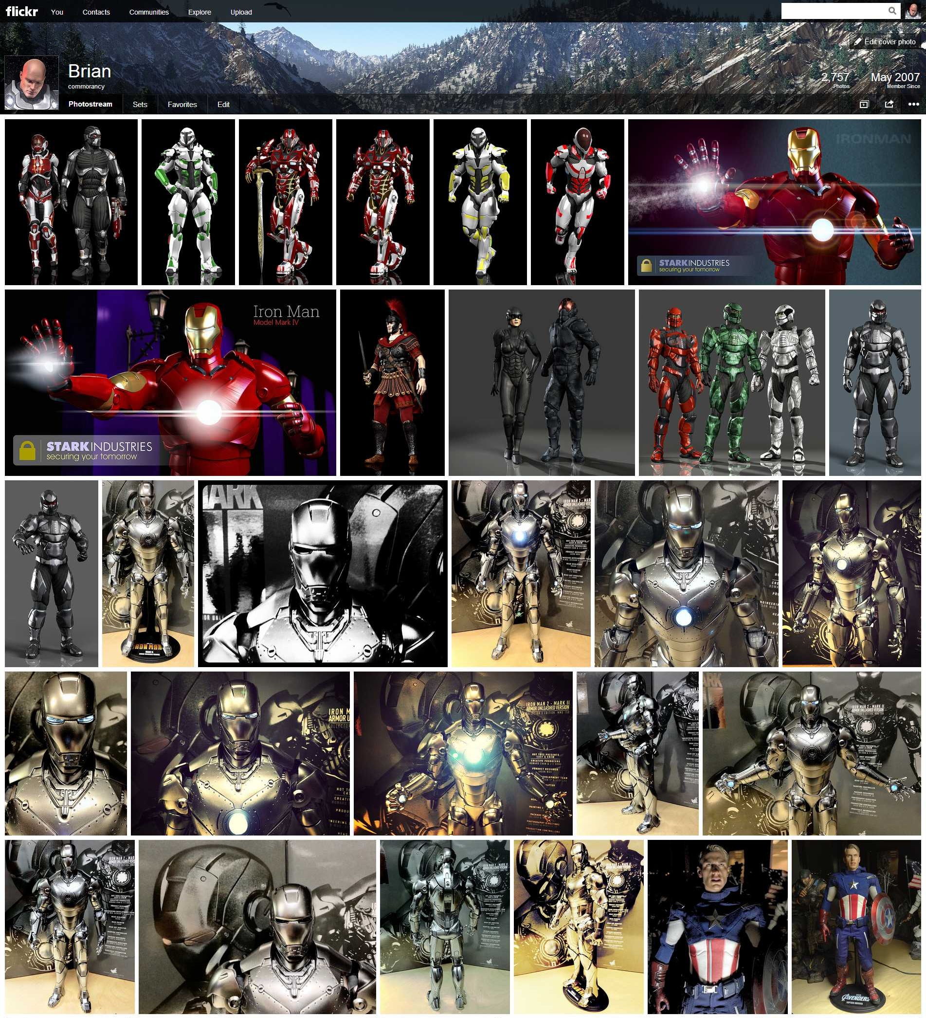
 It’s not often I write multiple articles involving the same topic, but in this case I’m making an exception. I think it’s important to explore and understand the reasons why I believe this new Flickr interface change is such a failure. As a visual artist, I look at the new Flickr interface and wonder what the designers were thinking? See the image to the left. It’s clear the designers were not aware of the many ways that users use Flickr. Let’s explore.
Original Flickr Interface
The original Flickr design was compelling (if not dated) for many reasons and was also useful for many different purposes. The reason the original interface held up so well and for so long is because the original designer’s vision still held true even today, dated as it may seem. “Why has it held up?”, you ask. Let’s examine.
The images were spaced just far enough apart that the images, colors and shapes didn’t clash with one another. Image thumbnails were generally of the same size whether portrait or landscape. The page was centered leaving white borders on the sides giving well enough space for the eye to rest. There were limited numbers of photos per page keeping down the clutter. There was just enough information below each image to give the necessary details about the image (like a placard in a Gallery). From a management perspective, there was also just enough information to show how popular an image is and whether or not it has comments.
Basically, this original interface, while somewhat antiquated and dated, was still very functional on many levels. Both amateur and professionals alike could use and reference this interface for their own purposes. Amateurs could use it to store their snaps. Professionals could direct paying clients to their portfolio without image clashing or the interface being too busy. It was well designed from the beginning for many purposes and uses.
With this original interface, Flickr even began offering limited customization of the page layout such as images alone or images with sets on the left or other similar layouts. Yes, it was always limited customization and I had always hoped for more customization features to come.
New Flickr Interface
The new ’tile’ interface (which incidentally looks too much like Windows 8 Metro) removes nearly every pixel of white space and fills the entire page (edge to edge) with images. It unfairly penalizes portrait image thumbnail sizes over much larger thumbnails for landscape aspect images. So, you have huge landscape sized thumbnails immediately beside tiny sized portrait thumbnails. More than that, because it removes all white space from the page and fills the entire screen with images, there is no place for the eye to rest. It becomes one big jumbled mess of a screen that’s hard to view and even harder to concentrate on a single image. While the original interface design kept the images spaced far enough apart to let you focus on a single image, the new interface doesn’t. Instead, it forces your eye to constantly jump around to find something else to view. This makes the page too busy and way too cluttered.
Worse, when your eyes get tired of focusing on the images, they begin to focus on the white borders between the images. Because the white borders are of odd shapes and sizes, it begins to take on the motif of a badly copied Mondrian painting. In other words, the entire interface is one big cluttered busy mess. It’s not pleasant to view for any period of time. So, instead of taking time to visit a Flickr site in a relaxing way, many people will likely get eye fatigue fast and browse away from the entire Flickr site. The new site makes you want to look at something less tiring and less stressful. Art should be about the images, not the layout making you queasy.
Worse, in no way does this new interface say ‘professional’.
Polar Opposite Reactions
I hear a lot of people say they like the interface. My first initial reaction was also positive. But, that only lasted for a few moments until I realized the problems. I initially liked it because it was something new and a change, but I quickly realized that it wasn’t ‘better’. I hear many people saying that it’s the worst thing they’ve ever seen. That it’s horrible. So, why does this interface generate such polar opposite reactions from so many people? It’s because Flickr went from a general purpose interface appealing to a wide array of people to an interface that appeals to only a small subset of those people.
For a casual photographer who takes photos of their dog or baby or kids, it gives a really great at-a-glance image set to know what you have. This especially works well when the images are mostly the same or a series of similar shots. Also, for those people who like coffee table books of images, this is the next best thing to that. You can bring it up at home on your screen and show people your photo album at a glance. It’s much easier to see all your images at once with this interface. For casual use, these are the people I’d expect to like the new interface. It makes seeing the images easy and they’re accessible. In other words, it’s a little like Facebook’s gallery style. But, that doesn’t make it any less cluttered, busy or stressful to view.
For the professional photographer, the exact opposite is true. You do not want your images crammed up on the same page together like this. It’s busy, cramped, the images don’t flow properly, your eye can’t focus and doesn’t allow your clients to focus on each single image easily. It pits too many images against each other vying for attention. This is bad for a professional. Again, it’s just too busy and cluttered. You would never intentionally build a portfolio that looks this way. Why would you ever expect this from a site like Flickr? So, for professionals, this is the absolute worst interface that could have been built to show off professional photographs in a professional way.
The same above for professional photographers also holds true for visual artists. If Flickr were a gallery, it would now be one wall cluttered with hundreds of images. If I were hanging my art in a gallery, I would want them spaced far enough apart that they don’t clash or create the wrong message. I also would be allowed to place my art in the order of my choosing. Yet, at Flickr, the photostream is still limited to the order in which it was uploaded. This is something that should have been fixed long before rolling out this new interface.
The Interface Mistake
Flickr developers have completely lost touch with why the original interface worked for pretty much every use case. It worked because it offered something for every level of photographer, casual through professional including visual artists. It was by no means a perfect interface. After all, it needed a lot of improvements. But, it worked and it worked well. It was also on its way to becoming something better especially with the latest round of customization features added.
Because the Flickr developers just didn’t clearly understand the full amount of use cases, they developed this new interface that entices primarily just one use case, casual users. The people who snap their baby, their dog, their house or whatever else they can find around the house. These are those people who want an at-a-glance style interface that’s big, bold, cluttered and in-your-face. A virtual coffee table book, if you will. Or, in other words, the Facebookers.
Professionals and visual artists don’t want this. They don’t need this. It’s not professional. It’s not the way you want your photos represented to a potential client. It’s reminiscent of video game or a mobile device or Facebook. It’s not representative of a gallery exhibit or of a portfolio. This is where the Flickr developers have lost touch.
Flickr is a Gallery
The designers need to firmly understand that Flickr is a gallery. We are creative people supplying creative images to this gallery. It’s not a video game. It’s not a mobile device. It’s not Facebook. It is an image gallery. We want to showcase our images, not show them off like some kind of video game or toy or social network. Treat the images with respect, not as toys.
Because it is a gallery, customization is in order. The tile interface is fine as one theme among many display themes, but not as the sole theme for Flickr. Flickr needs to take a page from the WordPress book and offer multiple themes and styles. Let us choose how our images are showcased to our visitors. Yes, customization could easily become haphazard and random, but that’s the nature of customization. It has to. I don’t necessarily recommend allowing CSS level editing, but I do recommend that gallery themes become available. The time has long come for this Flickr feature. This feature is what Flickr developers should have been working on. The tiles theme, again, should have been one in among many different themes available to choose.
Don’t lock me into one single theme that doesn’t allow for customization. If I don’t like it, there’s nothing I can do except move my images elsewhere. Offer me choice. Let me choose my theme and my presentation to visitors. Flickr could have chosen this theme as the default theme, but then let us go into a theme selector and choose among 10-20 different gallery themes. Choice is the answer, not busy unprofessional Facebooky tiles.
Separate Management Interface
Because I’m the manager over my images, I don’t necessarily want to see the same interface that my visitors do when managing my images. I want a separate management interface that allows me to see and manage my images at a glance. I want easy, fast access to my comments, sets, collections, view stats and everything surrounding my images. I don’t need to fumble through the visitor experience only to expend extra time attempting to manage my images through a cluttered and busy interface. I want a clean concise management interface that users don’t see. It doesn’t really matter how pretty the management interface is as long as it’s functional for image management. Functionality is the key to image management.
The Fiasco
There were a number of mistakes made here. The developers did not do enough homework to understand why the original interface worked so well for so many use cases before rolling out the new interface. They refused to see just how narrow of a use case is the new interface. It really only appeals to one of many use cases. Additionally, Yahoo offered no preview. In other words, there was no beta test for users to give feedback before rolling it out site wide. Offering a preview window would have saved Flickr a lot of grief and is probably the single biggest mistake Flickr made in this whole update.
Developmentally, the mistakes they made included not offering customization. Users have been clamoring for such features as rearranging the image order of their stream. I agree, I would love to have this feature and have been waiting for it for a very long time. I would like to see other features regarding things like frames and virtual lighting. I’d like to have seen more Ajax features (easy drag and arrange). Users want more customization, not less. Instead, they locked every single user into a single interface experience that not only alienates most professional use cases, it also offers no customization to change things about the interface. In other words, Flickr has take a huge step backwards. The interface may appear more slick, but the lack of customization takes us back to a time well before Yahoo ever bought Flickr.
Then it comes to bugs. Instead of actually correcting existing bugs and misfeatures, they worked on changing the style of the main page leaving all of the existing bugs and misfeatures out there. Seriously, the most important thing is to make the landing page ‘pretty’? What about all of the features that were not complete or the bugs that were not fixed, or the features that were never added?
The final mistake, the treatment of Pro account holders. With the increase to 1TB of space and upload limits well increased, the need to purchase Pro is really no longer necessary. Those who recently purchased a Pro account this year feel cheated out of their money. And, rightly so. Yahoo didn’t live up to their side of the deal with the money given to Flickr for Pro accounts. Instead, Yahoo basically thumbed its collective noses at the Pro account users not only from the monetary perspective, but also from interface perspective. Basically, Yahoo just completely tromped all over the Professional photographers who bought into the interface for that use, but also those who paid into the Pro accounts that gave bigger limits needed to be a Professional user. Yahoo hasn’t even addressed this issue at all.
Yahoo has a lot of work to do to repair Flickr Pro user relationships. Unfortunately, it’s probably too late. Many Professional photographers are already migrating their imagery away from Flickr to alternative services that are, hopefully, more reliable and offer more professional interfaces and support.
Lacking Support
Through this whole ordeal, Flickr support has remained amazingly silent. They asked for comments and have said nothing about it. They did state they were ‘listening’ for whatever that’s worth. But, we all know that listening and doing are two entirely separate things. There should have been a lot more help and support coming from the Flickr staff after such an amazingly huge change. Yet, it appears that the Flickr team has rolled the interface out in a fire-and-forget approach. Basically, with a ‘this is it’ attitude given off by those who have been able to get hold of a support person.
Clearly, if this is the level of support that Yahoo / Flickr is providing to users for this type of service, it’s probably worth moving on to a service where your money will get you real support when you need it. Where the support people actually do care about making a difference and keeping the customer happy.
By the time Flickr realizes the problem and manages to correct it, it will probably be too late. It’s probably already too late.
Flickr’s new interface review: Is it time to leave Flickr?
 Yahoo’s Flickr has just introduced their new ’tile’ interface (not unlike Windows Metro tiles) as the new user interface experience. Unfortunately, it appears that Yahoo introduced this site without any kind of preview, beta test or user feedback. Let’s explore.
Tile User Experience
The tiles interface at first may appear enticing. But, you quickly realize just how busy, cluttered, cumbersome and ugly this new interface is when you actually try to navigate and use it. The interface is very distracting and, again, overly busy. Note, it’s not just the tiles that are the problem. When you click an image from the tile sheet, it takes you to this huge black background with the image on top. Then you have to scroll and scroll to get to the comments. No, not exactly how I want my images showcased. Anyway, let me start by saying that I’m not a fan of these odd shaped square tile interfaces (that look like a bad copycat of a Mondrian painting). The interface has been common on the Xbox 360 for quite some time and is now standard for Windows Metro interface. While I’ll tolerate it on the Xbox as a UI, it’s not an enticing user experience. It’s frustrating and, more than that, it’s ugly. So, why exactly Yahoo decided on this user interface as their core experience, I am completely at a loss…. unless this is some bid to bring back the Microsoft deal they tossed out several years back. I digress.
Visitor experience
While I’m okay with the tiles being the primary visitor experience, I don’t want this interface as my primary account owner experience. Instead, there should be two separate and distinct interfaces. An experience for visitors and an experience for the account owner. The tile experience is fine for visitors, but keep in mind that this is a photo and art sharing site. So, I should be able to display my images in the way I want my users to see them. If I want them framed in black, let me do that. If I want them framed in white, let me do that. Don’t force me into a one-size-fits-all mold with no customization. That’s where we are right now.
Account owner experience
As a Flickr account owner, I want an experience that helps me manage my images, my sets, my collections and most of all, the comments and statistics about my images. The tile experience gives me none of this. It may seem ‘pretty’ (ahem, pretty ugly), but it’s not at all conducive to managing the images. Yes, I can hear the argument that there is the ‘organizr’ that you can use. Yes, but that’s of limited functionality. I preferred the view where I can see view numbers at a glance, if someone’s favorited a photo, if there are any comments, etc. I don’t want to have to dig down into each photo to go find this information, I want this part at a glance. Hence, the need for an account owner interface experience that’s separate from what visitors see.
Customization
This is a photo sharing site. These are my photos. Let me design my user interface experience to match the way I want my photos to be viewed. It is a gallery after all. If I were to show my work at a gallery, I would be able to choose the frames, the wall placement, the lighting and all other aspects about how my work is shown. Why not Flickr? This is what Flickr needs to provide. Don’t force us into a one-size-fits-all mold of something that is not only hideous to view, it’s slow to load and impossible to easily navigate. No, give me a site where I can frame my work on the site. Give me a site where I can design a virtual lighting concept. Give me a site where I can add virtual frames. Let me customize each and every image’s experience that best shows off my work.
Don’t corner me into a single user experience where I have no control over look and feel. If I don’t like the tile experience, let me choose from other options. This is what Flickr should have been designing.
No Beta Test?
Any site that rolls out a change as substantial as what Flickr has just pushed usually offers a preview window. A period of time where users can preview the new interface and give feedback. This does two things:
- Gives users a way to see what’s coming.
- Gives the site owner a way to tweak the experience based on feedback before rolling it out.
Flickr didn’t do this. It is huge mistake to think that users will just silently accept any interface some random designer throws out there. The site is as much the users as it is Yahoo’s. It’s a community effort. Yahoo provides us with the tools to present our photos, we provide the photos to enhance their site. Yahoo doesn’t get this concept. Instead, they have become jaded to this and feel that they can do whatever they want and users will ‘have’ to accept it. This is a grave mistake for any web sharing site, least of all Flickr. Flickr, stop, look and listen. Now is the time.
Photo Sharing Sites
In among Flickr, there are many many photo sharing sites on the Internet. Flickr is not the only one. As content providers, we can simply take our photos and move them elsewhere. Yahoo doesn’t get this concept. They think they have some kind of captive audience. Unfortunately, this thinking is why Yahoo’s stock is now at $28 a share and not $280 a share. We can move our photos to a place where there’s a better experience (i.e., Picasa, DeviantArt, Photobucket, 500px, etc). Yahoo needs to wake up and realize they are not the only photo sharing site on the planet.
Old Site Back?
No, I’m not advocating to move back to the old site. I do want a new user experience with Flickr. Just not this one. I want an experience that works for my needs. I want an interface that let’s me showcase my images in the way I want. I want a virtual gallery that lets me customize how my images are viewed and not by using those hideous and slow tiles. Why not take a page from the WordPress handbook and support gallery themes. Let me choose a theme (or design my own) that lets me choose how to best represent my imagery. This is the user experience that I want. This is the user experience I want my visitors to have. These are my images, let me show them in their best light.
Suggestions for @Yahoo/@Flickr
Reimagine. Rethink. Redesign. I’m glad to see that Yahoo is trying new things. But, the designers need to be willing to admit when a new idea is a failure and redesign it until it does work. Don’t stop coming up with new ideas. Don’t think that this is the way it is and there is nothing more. If Yahoo stops at this point with the interface as it is now, the site is dead and very likely with it Yahoo. Yahoo is very nearly on its last legs anyway. Making such a huge blunder with such a well respected (albeit antiquated site) could well be the last thing Yahoo ever does.
Marissa, have your engineers take this back to the drawing board and give us a site that we can actually use and that we actually want to use.


13 comments