Amazon How-To: The ASIN
![]() Many thousands of people shop Amazon daily. Did you know that every product at Amazon has a unique identifier? In most stores it’s called an SKU or stock-keeping unit. Amazon’s stock code is called the Amazon Standard Identification Number or ASIN. Let’s explore.
Many thousands of people shop Amazon daily. Did you know that every product at Amazon has a unique identifier? In most stores it’s called an SKU or stock-keeping unit. Amazon’s stock code is called the Amazon Standard Identification Number or ASIN. Let’s explore.
Product Identifiers
Every product stocked at any retailer uses a product identifier to locate that product in its database. In fact, many retailers have their own unique identifiers which are separate from such other identifiers as the Universal Product Code (UPC) or the Industry Standard Book Number (ISBN). In Amazon’s case, its unique identifier is the ASIN, not the UPC. The ASIN is visible on the URL of every product you view on Amazon. It’s a 10 digit code containing both letters and numbers. For example, a pair of cut resistant gloves has the ASIN of B012AFX9VY.
Many store products might have as many as two, three or even four unique identifiers. Books, for example, use the ISBN as an identifier in addition to the UPC code and Amazon’s ASIN. However, stores and online retailers typically use their own product identifier to identify stock in their system. For example, Target’s stock identifier is the DPCI code which goes back to Target’s original days of price stickering or tagging its merchandise with a Department, Class and Item… hence DPCI.
Even the UPC code, which is typically used at the register to ring up items, is simply translated to Target’s, Best Buy’s, Walmart’s or Amazon’s unique product identifier to locate the item and its price in its database.
How is the ASIN helpful?
Knowing the ASIN is useful because this quick identifier allows you to locate to a product on Amazon easily. If you’re on Amazon’s web site, you simply need enter the product ASIN into Amazon’s search panel and it will immediately bring up that item’s listing.
If you’re off of Amazon’s web site and you have the ASIN, you can easily craft a URL that will lead you to Amazon’s product listing in your browser. To craft a functional URL, is simple…
Append the ASIN number to the following URL: https ://amzn.com/ASIN … or in the case of these gloves: https://amzn.com/B012AFX9VY.
While that domain may seem strange, Amazon does own the amzn.com domain. This domain is actually intended to be used as a URL shortener for locating Amazon products in combination with an ASIN. Simply by post-appending the ASIN to this much shorter URL, you can feed this into your browser’s URL field and get right to the product’s details, pricing and all of that information. You can also use it on social media sites as a much shorter URL to aid with character limit restrictions.
Product Reviews
Many of us rely on Amazon’s product reviews to know whether the product is worth considering. Many of us also contribute to Amazon’s product review area for the products we purchase, particularly when we feel strongly about the item’s quality (good or bad).
Amazon has recently taken its website backwards in time (before Web 2.0). Amazon’s older editor was much more feature rich than its newest editor.
When writing product reviews, you could immediately search for items right in the ‘Insert Product Link’ area and then insert those product links and place them into your product review. Unfortunately, with Amazon’s recent interface change, Amazon web developers have inexplicably removed the insertion of product links via this former feature. Now, you have to know the product’s ASIN and craft a product link yourself.
Worse, you can only get access to this ‘Insert Product Link’ feature when you’re crafting a new comment on a product reviews, not when creating or editing a new product review. Odd. You don’t even get it when you edit a comment.
Here’s the latest search panel when attempting to insert a product link:

As you can see, it’s odd. I mean, why even change it to this non-intuitive interface? Now you are required to open a new browser tab, go chase down the product using that separate browser tab, copy the URL then come back to this panel and paste it in and hit enter. That’s a lot of extra work which could be done (and was previously offered directly) in this panel. After that, it will either find the product and offer a SELECT button or fail to provide you with anything. And that “http ://…” nonsense is entirely misleading.
You can enter ASIN numbers right in this field and it will locate Amazon’s products from this panel strictly using the ASIN only, even though it does not indicate this in any way. No need to type in that silly http:// stuff. I’m not even sure why they want you to spend the time to go find and insert URLs here. Why can’t this panel search in Amazon’s product database directly with key words? Ugh.. Oh Amazon, sometimes I just don’t get you and your want to be obtuse.
Creating / Editing Product Reviews
Let’s move on. The new product review editor no longer offers a facility for inserting product links via a search helper tool. It’s simply gone. Poof. Nada. However, you can insert them if you happen to know the format, but you’ll have to manually craft them using the ASIN or ISBN.
If you’re wanting to add product links to your review, you have to now do it ALL manually. I’m entirely unsure why Amazon’s web development team decided to take this odd backwards step in its user interface, but here we are. You would think Amazon would be pleased to have people hawking additional products in their product reviews, but based on this step backwards, I’m guessing not. Either that, or someone at Amazon is clueless… maybe it’s a bit of both? *shrug*
Crafting Product Links in your Product Reviews
When you’re writing a product review and you realize you’d like to insert one or more product links into your review using the completely idiotic ‘new’ (and I use the term ‘new’ very loosely) and far less intuitive editor, you’ll need to craft them yourself.
The format of an Amazon product link is as follows:
[[ASIN:B012AFX9VY The Product’s Description Here]]
Example:
[[ASIN:B0792KTHKJ Echo Dot (3rd Gen) – Smart speaker with Alexa – Charcoal]]
The format of the product link is:
[[ID_TYPE:ID_NUMBER PRODUCT_DESCRIPTION]]
where
ID_TYPE = ASIN, ISBN or any other product identifier which Amazon supports
ID_NUMBER = The product’s unique identifier, like B012AFX9VY
PRODUCT_DESCRIPTION = The description of the product with spaces
Once you create a product link, you can use it in place of words and it will show a clickable link. Take note that there’s no space after [[ or before ]]. For example:
This product offers you two pairs of [[ASIN:B012AFX9VY Black Stainless Steel Cut Resistant Gloves]] for use in the kitchen.
once published, the sentence should translate to…
This product offers you two pairs of Black Stainless Steel Cut Resistant Gloves for use in the kitchen.
Questionable Changes
Because Amazon seems intent on sabotaging and gutting its own web user interface at the expense of important and useful features for shoppers, it’s possible that such product links may no longer function at some point in the future. You’ll want to try this out and see if this tip works for you. If it doesn’t work, it’s very possible that Amazon no longer allows product links inside its reviews. However, they are still available as of this writing. If you find that product links no longer work, please let me know in the comments below.
However, the https ://amzn.com/ASIN should continue to work unless Amazon loses or dumps this domain. Note that this feature doesn’t work when using https ://amazon.com/ASIN. Amazon’s primary domain of amazon.com is not set up to handle short ASIN link syntax. You’ll need to use the amzn.com domain instead.
If this information helps you, please leave a comment below. If not, then please leave a comment below and let me know that, too. Happy shopping and reviewing!
↩︎
Flickr’s new interface review: Is it time to leave Flickr?
 Yahoo’s Flickr has just introduced their new ’tile’ interface (not unlike Windows Metro tiles) as the new user interface experience. Unfortunately, it appears that Yahoo introduced this site without any kind of preview, beta test or user feedback. Let’s explore.
Tile User Experience
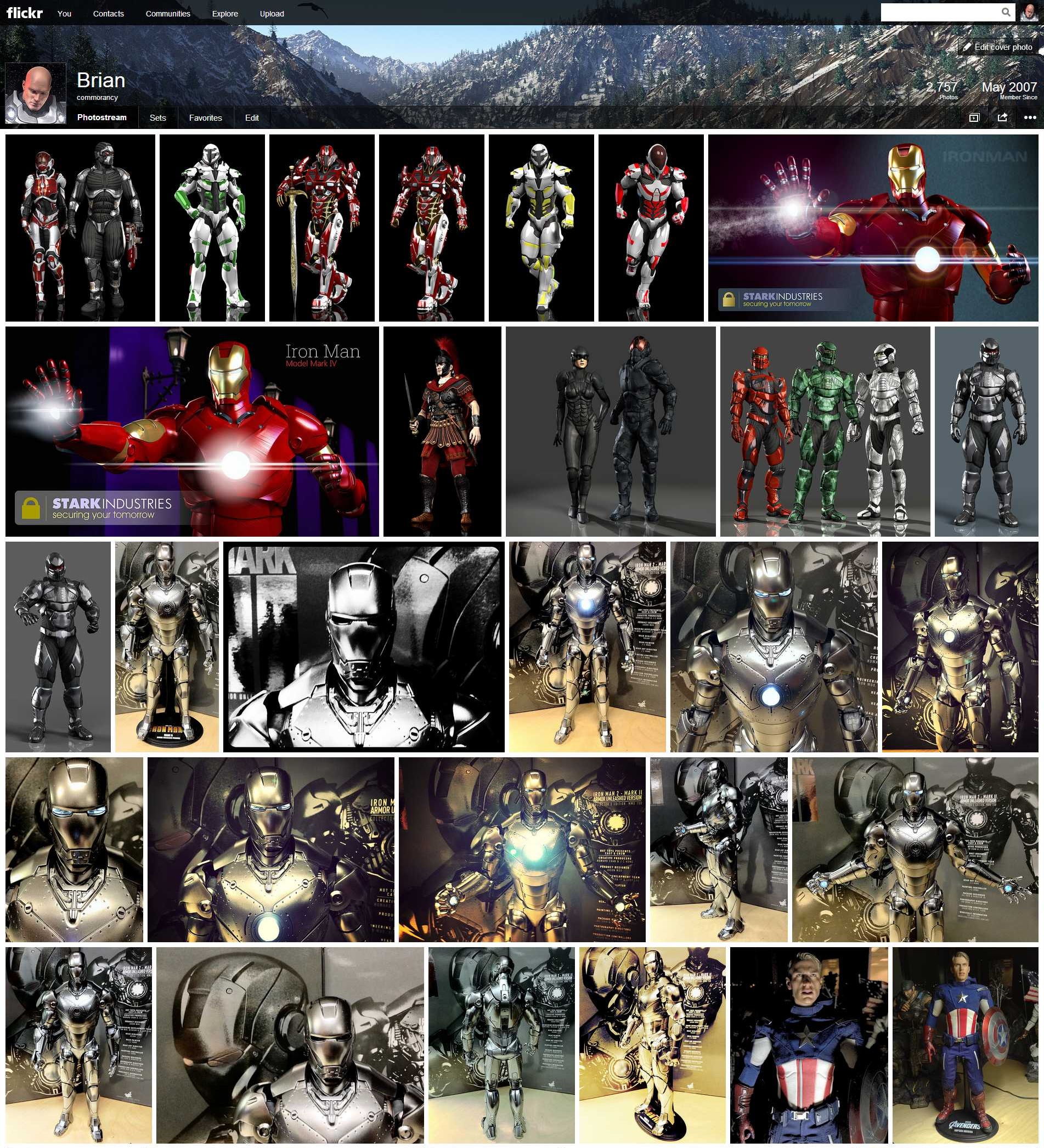
The tiles interface at first may appear enticing. But, you quickly realize just how busy, cluttered, cumbersome and ugly this new interface is when you actually try to navigate and use it. The interface is very distracting and, again, overly busy. Note, it’s not just the tiles that are the problem. When you click an image from the tile sheet, it takes you to this huge black background with the image on top. Then you have to scroll and scroll to get to the comments. No, not exactly how I want my images showcased. Anyway, let me start by saying that I’m not a fan of these odd shaped square tile interfaces (that look like a bad copycat of a Mondrian painting). The interface has been common on the Xbox 360 for quite some time and is now standard for Windows Metro interface. While I’ll tolerate it on the Xbox as a UI, it’s not an enticing user experience. It’s frustrating and, more than that, it’s ugly. So, why exactly Yahoo decided on this user interface as their core experience, I am completely at a loss…. unless this is some bid to bring back the Microsoft deal they tossed out several years back. I digress.
Visitor experience
While I’m okay with the tiles being the primary visitor experience, I don’t want this interface as my primary account owner experience. Instead, there should be two separate and distinct interfaces. An experience for visitors and an experience for the account owner. The tile experience is fine for visitors, but keep in mind that this is a photo and art sharing site. So, I should be able to display my images in the way I want my users to see them. If I want them framed in black, let me do that. If I want them framed in white, let me do that. Don’t force me into a one-size-fits-all mold with no customization. That’s where we are right now.
Account owner experience
As a Flickr account owner, I want an experience that helps me manage my images, my sets, my collections and most of all, the comments and statistics about my images. The tile experience gives me none of this. It may seem ‘pretty’ (ahem, pretty ugly), but it’s not at all conducive to managing the images. Yes, I can hear the argument that there is the ‘organizr’ that you can use. Yes, but that’s of limited functionality. I preferred the view where I can see view numbers at a glance, if someone’s favorited a photo, if there are any comments, etc. I don’t want to have to dig down into each photo to go find this information, I want this part at a glance. Hence, the need for an account owner interface experience that’s separate from what visitors see.
Customization
This is a photo sharing site. These are my photos. Let me design my user interface experience to match the way I want my photos to be viewed. It is a gallery after all. If I were to show my work at a gallery, I would be able to choose the frames, the wall placement, the lighting and all other aspects about how my work is shown. Why not Flickr? This is what Flickr needs to provide. Don’t force us into a one-size-fits-all mold of something that is not only hideous to view, it’s slow to load and impossible to easily navigate. No, give me a site where I can frame my work on the site. Give me a site where I can design a virtual lighting concept. Give me a site where I can add virtual frames. Let me customize each and every image’s experience that best shows off my work.
Don’t corner me into a single user experience where I have no control over look and feel. If I don’t like the tile experience, let me choose from other options. This is what Flickr should have been designing.
No Beta Test?
Any site that rolls out a change as substantial as what Flickr has just pushed usually offers a preview window. A period of time where users can preview the new interface and give feedback. This does two things:
- Gives users a way to see what’s coming.
- Gives the site owner a way to tweak the experience based on feedback before rolling it out.
Flickr didn’t do this. It is huge mistake to think that users will just silently accept any interface some random designer throws out there. The site is as much the users as it is Yahoo’s. It’s a community effort. Yahoo provides us with the tools to present our photos, we provide the photos to enhance their site. Yahoo doesn’t get this concept. Instead, they have become jaded to this and feel that they can do whatever they want and users will ‘have’ to accept it. This is a grave mistake for any web sharing site, least of all Flickr. Flickr, stop, look and listen. Now is the time.
Photo Sharing Sites
In among Flickr, there are many many photo sharing sites on the Internet. Flickr is not the only one. As content providers, we can simply take our photos and move them elsewhere. Yahoo doesn’t get this concept. They think they have some kind of captive audience. Unfortunately, this thinking is why Yahoo’s stock is now at $28 a share and not $280 a share. We can move our photos to a place where there’s a better experience (i.e., Picasa, DeviantArt, Photobucket, 500px, etc). Yahoo needs to wake up and realize they are not the only photo sharing site on the planet.
Old Site Back?
No, I’m not advocating to move back to the old site. I do want a new user experience with Flickr. Just not this one. I want an experience that works for my needs. I want an interface that let’s me showcase my images in the way I want. I want a virtual gallery that lets me customize how my images are viewed and not by using those hideous and slow tiles. Why not take a page from the WordPress handbook and support gallery themes. Let me choose a theme (or design my own) that lets me choose how to best represent my imagery. This is the user experience that I want. This is the user experience I want my visitors to have. These are my images, let me show them in their best light.
Suggestions for @Yahoo/@Flickr
Reimagine. Rethink. Redesign. I’m glad to see that Yahoo is trying new things. But, the designers need to be willing to admit when a new idea is a failure and redesign it until it does work. Don’t stop coming up with new ideas. Don’t think that this is the way it is and there is nothing more. If Yahoo stops at this point with the interface as it is now, the site is dead and very likely with it Yahoo. Yahoo is very nearly on its last legs anyway. Making such a huge blunder with such a well respected (albeit antiquated site) could well be the last thing Yahoo ever does.
Marissa, have your engineers take this back to the drawing board and give us a site that we can actually use and that we actually want to use.


leave a comment