Flickr’s new interface review: Is it time to leave Flickr?
 Yahoo’s Flickr has just introduced their new ’tile’ interface (not unlike Windows Metro tiles) as the new user interface experience. Unfortunately, it appears that Yahoo introduced this site without any kind of preview, beta test or user feedback. Let’s explore.
Tile User Experience
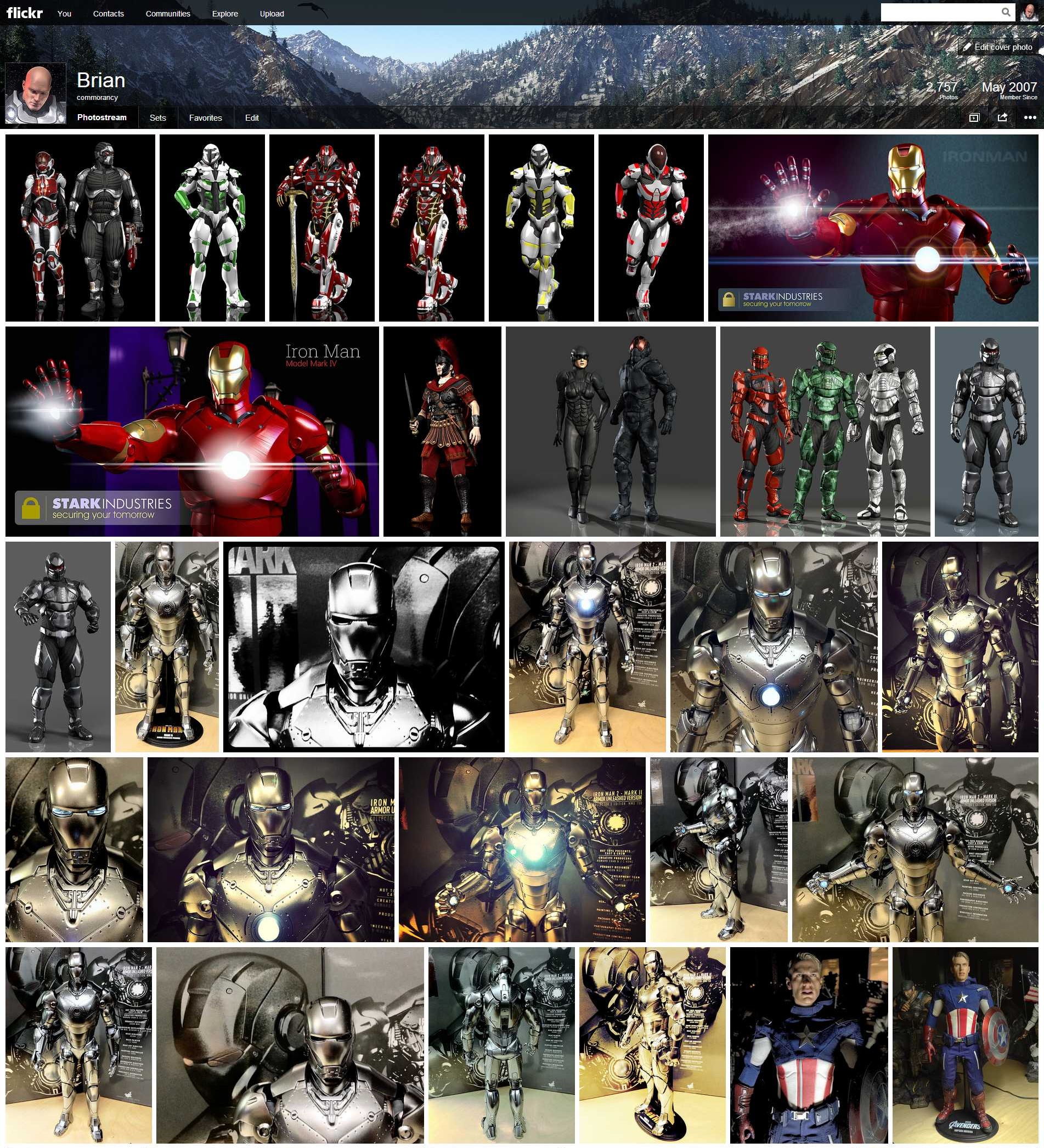
The tiles interface at first may appear enticing. But, you quickly realize just how busy, cluttered, cumbersome and ugly this new interface is when you actually try to navigate and use it. The interface is very distracting and, again, overly busy. Note, it’s not just the tiles that are the problem. When you click an image from the tile sheet, it takes you to this huge black background with the image on top. Then you have to scroll and scroll to get to the comments. No, not exactly how I want my images showcased. Anyway, let me start by saying that I’m not a fan of these odd shaped square tile interfaces (that look like a bad copycat of a Mondrian painting). The interface has been common on the Xbox 360 for quite some time and is now standard for Windows Metro interface. While I’ll tolerate it on the Xbox as a UI, it’s not an enticing user experience. It’s frustrating and, more than that, it’s ugly. So, why exactly Yahoo decided on this user interface as their core experience, I am completely at a loss…. unless this is some bid to bring back the Microsoft deal they tossed out several years back. I digress.
Visitor experience
While I’m okay with the tiles being the primary visitor experience, I don’t want this interface as my primary account owner experience. Instead, there should be two separate and distinct interfaces. An experience for visitors and an experience for the account owner. The tile experience is fine for visitors, but keep in mind that this is a photo and art sharing site. So, I should be able to display my images in the way I want my users to see them. If I want them framed in black, let me do that. If I want them framed in white, let me do that. Don’t force me into a one-size-fits-all mold with no customization. That’s where we are right now.
Account owner experience
As a Flickr account owner, I want an experience that helps me manage my images, my sets, my collections and most of all, the comments and statistics about my images. The tile experience gives me none of this. It may seem ‘pretty’ (ahem, pretty ugly), but it’s not at all conducive to managing the images. Yes, I can hear the argument that there is the ‘organizr’ that you can use. Yes, but that’s of limited functionality. I preferred the view where I can see view numbers at a glance, if someone’s favorited a photo, if there are any comments, etc. I don’t want to have to dig down into each photo to go find this information, I want this part at a glance. Hence, the need for an account owner interface experience that’s separate from what visitors see.
Customization
This is a photo sharing site. These are my photos. Let me design my user interface experience to match the way I want my photos to be viewed. It is a gallery after all. If I were to show my work at a gallery, I would be able to choose the frames, the wall placement, the lighting and all other aspects about how my work is shown. Why not Flickr? This is what Flickr needs to provide. Don’t force us into a one-size-fits-all mold of something that is not only hideous to view, it’s slow to load and impossible to easily navigate. No, give me a site where I can frame my work on the site. Give me a site where I can design a virtual lighting concept. Give me a site where I can add virtual frames. Let me customize each and every image’s experience that best shows off my work.
Don’t corner me into a single user experience where I have no control over look and feel. If I don’t like the tile experience, let me choose from other options. This is what Flickr should have been designing.
No Beta Test?
Any site that rolls out a change as substantial as what Flickr has just pushed usually offers a preview window. A period of time where users can preview the new interface and give feedback. This does two things:
- Gives users a way to see what’s coming.
- Gives the site owner a way to tweak the experience based on feedback before rolling it out.
Flickr didn’t do this. It is huge mistake to think that users will just silently accept any interface some random designer throws out there. The site is as much the users as it is Yahoo’s. It’s a community effort. Yahoo provides us with the tools to present our photos, we provide the photos to enhance their site. Yahoo doesn’t get this concept. Instead, they have become jaded to this and feel that they can do whatever they want and users will ‘have’ to accept it. This is a grave mistake for any web sharing site, least of all Flickr. Flickr, stop, look and listen. Now is the time.
Photo Sharing Sites
In among Flickr, there are many many photo sharing sites on the Internet. Flickr is not the only one. As content providers, we can simply take our photos and move them elsewhere. Yahoo doesn’t get this concept. They think they have some kind of captive audience. Unfortunately, this thinking is why Yahoo’s stock is now at $28 a share and not $280 a share. We can move our photos to a place where there’s a better experience (i.e., Picasa, DeviantArt, Photobucket, 500px, etc). Yahoo needs to wake up and realize they are not the only photo sharing site on the planet.
Old Site Back?
No, I’m not advocating to move back to the old site. I do want a new user experience with Flickr. Just not this one. I want an experience that works for my needs. I want an interface that let’s me showcase my images in the way I want. I want a virtual gallery that lets me customize how my images are viewed and not by using those hideous and slow tiles. Why not take a page from the WordPress handbook and support gallery themes. Let me choose a theme (or design my own) that lets me choose how to best represent my imagery. This is the user experience that I want. This is the user experience I want my visitors to have. These are my images, let me show them in their best light.
Suggestions for @Yahoo/@Flickr
Reimagine. Rethink. Redesign. I’m glad to see that Yahoo is trying new things. But, the designers need to be willing to admit when a new idea is a failure and redesign it until it does work. Don’t stop coming up with new ideas. Don’t think that this is the way it is and there is nothing more. If Yahoo stops at this point with the interface as it is now, the site is dead and very likely with it Yahoo. Yahoo is very nearly on its last legs anyway. Making such a huge blunder with such a well respected (albeit antiquated site) could well be the last thing Yahoo ever does.
Marissa, have your engineers take this back to the drawing board and give us a site that we can actually use and that we actually want to use.


10 comments