Zazzle: An exercise in stupidity
I love the idea that Zazzle represents. Quick custom printed promotional items. The theory is that you open a store, upload an image, place it onto an item and order. You can even let other people order it. Unfortunately, that’s pretty much where the idea ends.. at least with this company. Let’s explore.
What is Zazzle?
As I said, it’s basically one big short run promotional item tool. You upload your images, plop them into a garment, mug, stein, iPad case or whatever and order. The theory is that they’ll ship you the item(s) you ordered. What is reality is far different. The reason it’s far different is because this company is completely mismanaged. In fact, it appears there’s no real management driving this listing ship at all. Certainly on the surface, there appears to be the Beaver family who started up the thing that formerly was Zazzle. Now, it’s just a topsy-turvy disaster of a company that can barely even accomplish their core business offerings.
Content Management
Let’s start with the absolute most mismanaged piece of this company. The content management team. This team sits around reviewing what’s been uploaded for ‘violations’ and ‘copyright infringement’. Unfortunately, the management team doesn’t ‘get’ copyright infringement at all. In fact, the law is fairly clear on the point of copyright infringement. It’s not actually infringement until a court of law deems it so. Remember, innocent until proven guilty? To the Zazzle team, however, that a company makes a claim that something is infringing is enough to prove guilt. To prove actual infringement requires a court of law, not Zazzle. Worse, this company is policing alleged infringement on behalf of companies like Electronic Arts. It’s not Zazzle’s responsibility to police any other party’s content. Each party who owns copyrighted material can very well police and ask for removal. Zazzle doesn’t need to intervene here.
However, because companies (especially Silicon Valley companies) are running so scared that they’ll even get the slightest hint of a lawsuit, they have begun acting on behalf of companies like Electronic Arts and taking down imagery that even has the tiniest tinge of violating copyrights. Unfortunately, this company’s team must be bunch of hired monkeys. They simply see the word ‘Crysis’ and they automatically assume infringement and take the work offline. They don’t read, ask questions or bother to even review the actual image itself (which is what is actually in question). No, it’s all run by a bunch of monkeys trained to click delete. See word, click delete.
Forget about disputing any monkey deletes. There’s no reasoning or rational thought behind this team. If you create a ticket to try and dispute, you’ll get a canned response that won’t even tell you why it was deleted. They’ll just point you to the terms and conditions and let you be on your merry way. In short, they don’t want to talk to you, a store owner. Consider for a moment just how stupid that is because store owners are what’s keeping Zazzle in business.
Just The Tip
The Content Management team is merely the tip of this iceberg. I’ve seen so many complaints regarding this company that they are even listed on Ripoff Report 20 times (so far). Worse, no one from the company even reviews Ripoff Report to post rebuttals or head off any of these disputes. As I said, this company is squarely mismanaged.
If you are in business, you would want to take that business seriously. By ‘seriously’, that means treating all consumer complaints as valid and doing something about. You don’t let complaints stew and fester unless you actually want your company to appear to be a ripoff.
Stores
Part of the way this company works is by allowing registered users to put up their own Zazzle store where they can market and sell custom items from within Zazzle’s inventory. This is, in fact, where Zazzle makes its money. Store owners put up content, Zazzle takes a cut on each item sold. Unfortunately, that’s pretty much where this story ends. Even if you do manage to get your imagery through the Content Management team’s monkey review, that doesn’t mean your item will really ship if you place an order. According to some complainants, the items never arrive. Basically, when you pay, you are taking your chances that the item will actually arrive.
Even worse, though, is that you spend your time, effort and good faith into placing your items in the Zazzle store. Yet there’s no promotional system or anything you can leverage to try and get people into your store to buy. You’re squarely left to fend for yourself to get people into your store. You would think Zazzle would offer at least some kind of promotional vehicle to feature stores with certain types of items. But, no. There is no advertising system available. Again, you are left to fend for yourself. It’s up to you to post on Facebook, Twitter and buy advertising space to get people into your Zazzle store.
Worse, even if you do manage to get people into your store to buy, those people could then have problems just getting their paid items.
No ‘About The Company’ page?
For me, this is a huge problem with any company trying to be respectable in its industry. If you aren’t willing to put up information regarding your management team, where that team is located, investor information, address information, etc.. it certainly looks like you’re not really serious about being in business. If you visit Zazzle’s corporate information page, you will find nothing there about the management team, investor information or anything pertinent to this company.
If anything, this lack of information says they are a ripoff fly-by-night. I know, they’ve been in business for several years now, but who knows how that’s happened as mismanaged as this thing is. However, even former employees have choice things to say on Glassdoor. The primary complaints seem to be high turnover, low pay and lack of upward movement. That doesn’t surprise me. Seems to me this is the McDonald’s of Silicon Valley startups.
Recommendation
If you’re a company thinking of opening a Zazzle store, you should reconsider. Attaching your company’s name to Zazzle could taint your business reputation in the long term. This is especially true if you’re trying to grow an existing business. The last thing you need is dealing with complaints from people who’ve tried to purchase from your Zazzle store only to be ripped off.
Instead, if you really do want to buy custom printed items, you will want to get them from somewhere else. There are thousands of reputable promotional item companies who create and sell printed promotional items. In fact, you can do much better in pricing on those items when you buy them in bulk. Zazzle is really to be used for extremely short runs (1-10 pieces). With short runs, you will pay a high premium price, which is quite evident in the pricing model Zazzle offers.
Instead, I highly recommend you shop around for companies whose sole business it is to sell custom printed promotional items. Promotional item companies don’t offer store fronts to people, don’t deal with content management, don’t do short runs, don’t deal with individual consumer returns, etc. No, they are solely focused on getting you your promotional items exactly as you want and shipping them directly to you. Yes, you’ll end up paying more up front for the bulk quantity, but if you’re giving the items away at a conference or event, the cost per item is much much lower. Better, you can pick the exact quality of the item you want. With Zazzle, the quality is what it is. There’s little choice. If you don’t like the t-shirt brands they are using, tough luck. If you want to buy a specific brand of polo-style shirts to give away, you’ll need to choose another company to produce your item.
iOS7: Lightning Cables vs Consumer — Who Wins?
There’s this really annoying error message that you might see if you’ve bought a third party Lightning cable and you try to use it on your iPhone under iOS7. The error message reads “This cable or accessory is not certified and may not work reliably with this iPod” (or iPhone or iPad or whatever). Let’s explore what this means.
Consumer Penalized
 Let’s start simple. You bought a Lightning cable and expected it to work. Within each Lightning cable there’s a unique identifier that an Apple device can read. It then compares the identifier to some kind of database within the iDevice to see if Apple ‘blessed’ the cable. Basically, any company producing Lightning connector cables must license the technology from Apple.
I’m fine with licensing. But, that’s a legal distinction between the cable manufacturer and Apple. The consumer should not be involved in this fight. Yet, here we are. This battle is being waged on you, the Apple consumer. You’re penalized for having bought an ‘unlicensed’ cable. Unfortunately, unlicensed cables don’t specifically come with a warning stating that they are not licensed. So, the consumer is buying blind when buying cables. There is no way to know if a cable is licensed or not. At least, not without an Apple device that tells us so.
Apple’s missteps
With the old big dock connectors, the devices were able to recognize unsupported accessories or cables and warn. And, they did. Those cables also had a method to do validation checks similar to this Lightning validation error message. Again, I’m fine with that as long is tells me immediately after I purchase a cable and plug it in. If it doesn’t work immediately after purchase, I can return cable immediately. No money lost.
Unfortunately, Apple waited all through iOS6 and the iPhone 5 allowing use of the Lightning connector without ANY warning. Instead, they waited until iOS7’s release to warn the consumer and even prevent some cables from working AT ALL. Yes, that’s what this error message actually means. It means that Apple has detected an unlicensed cable and in some cases will warn that it either cannot use it or warns you that it may not work. Apparently, that warning message may warn for a number of times before permanently disabling the cable’s use.
While these cables worked perfectly fine with iOS6, some of them don’t work at all to either charge the device or for data transfer under iOS7. Some of the cables do work, but possibly for only a short time. But, this isn’t the point. If the cables worked perfectly fine under iOS6, they will also work perfectly fine under iOS7. This means that Apple is deliberately and intentionally preventing these cables from working.
Waited Too Long

The huge misstep is that Apple waited over a year to warn consumers. And when something is finally given to us, it’s not a friendly notice. The device simply prevents some cables from outright working. Keep in mind that that’s a year of time that many people spent money buying many of these cables. Cables that can no longer be returned and can no longer be used. Apple has waged war on you, the consumer. They are not waging war on the manufacturer who produced ‘unlicensed’ cables. This action is actually causing monetary damages to the consumer for the lost money spent to purchase the cables. Some cables that previously worked no longer work and the consumer cannot return them nor can these cables be used.
Apple has effectively just slapped its very user base in the face and said, ‘F-you’. I can’t imagine any other company doing this in this way. At least give your users some advance warning this is coming. Don’t just do it, tell no one and expect us all to sit here all nice and happy. It’s not my problem that manufacturers are making ‘uncertified’ cables. That’s your problem, Apple. You need to take those manufacturers to court. Don’t penalize your paying consumers because you don’t think the cables should work.
And note, the cable I purchased is a retractable cable. I only bought it because there was no other retractable Lightning cable on the market when I purchased. If Apple had produced one, I’d have bought it from Apple.
Class Action Lawsuit
I can easily see this turn into a class action lawsuit against Apple. As a consumer, we had no way to know the cable wasn’t licensed until the warning message, a warning message that showed up over a year late. And, in fact, iOS7 doesn’t even state the cable is unlicensed, it states that it’s not certified. As a consumer, that’s not my problem. I bought the cable, it worked. iOS6 didn’t warn me of this problem and it continued to work. Now, Apple is telling me that that cable can no longer work with my device even though it worked perfectly fine with the same exact device for many months prior to iOS7.
Plain and simple, consumers have now lost money paid for these cables. Apple is to blame. If they had enforced this policy from the beginning, this wouldn’t be an issue. Because they didn’t, consumers are now literally paying the price as Apple intentionally stops these cables from working even though they are perfectly usable cables.
I’d really like to see an attorney sue the crap out of Apple for this behavior and force Apple to redress all of us consumers’ for our money that we’ve lost because Apple sat on its fat butt not saying anything. Apple just sat there letting consumers buy more and more unlicensed cables. Then, after letting consumers buy these cables for a year, they lay the whammy down and stop the cables from working right now.
Now many of us have dead cables that we can’t use, can’t sell and that we spent good money on. And many of these cables were not cheap and were not marked as not licensed. At minimum, Apple should be required to cable swap all consumer purchased now non-working unlicensed Lightning cables for an Apple licensed cable so we’re not out any money. It’s not the consumer’s fault Apple didn’t warn the consumer properly. It’s also not the consumer’s fault the manufacturer sold us an unlicensed cable. That fight is clearly between Apple and the cable manufacturer. Apple, take your fight to where it belongs.. between you and the manufacturer. Don’t take it out on the very customer that you depend upon to keep you in business. Not a smart move.
As a consumer, I simply want a fully working retractable cable without stupid warning messages or I want my money back. Apple, you clearly owe me a replacement cable for waiting a year to warn me thus losing my ability to return the cable.
IOS7: The New Android?
Note, apparently some readers think I do a lot of ranting. Sometimes I do. In this case, you better get prepared for a rant of epic proportions because here it comes.
White screens and borders, really?

Ok, so when I flipped open my iPad the first time on IOS7, I’m greeted by white screens (or nearly white screens). At first I wasn’t sure to make of it. Now, I’m quite sure. The white screens must go. If you’re trying to use the iPad in the dark, it’s like having a flashlight shining in your face. No, thanks.
Not only are the white screens extremely distracting, they’re hard on the eyes and there’s nothing quite like staring at the end of a flashlight when you’re sitting in the dark. No, bad idea. Worse, whatever happened to the light sensor? Come on Apple. You put the sensor on the unit, use the damned thing will you? If I’m in a low light environment, choose a background that complements the low light environment. If I’m in a high light environment, again, choose a brighter background to make the contrast stand out. I don’t need to be blinded in the dark and I don’t want to see a washed out screen when it’s bright outside.
Gag! the Calendar app has that white background with red letters by default. Red? Really?!? I may have to rethink my Calendaring again.Whatever happened to all of that great engineering that used to work at Apple? I think they’ve all gone to Android. Let’s put some thinking caps on shall we?
What’s worse than white screens?
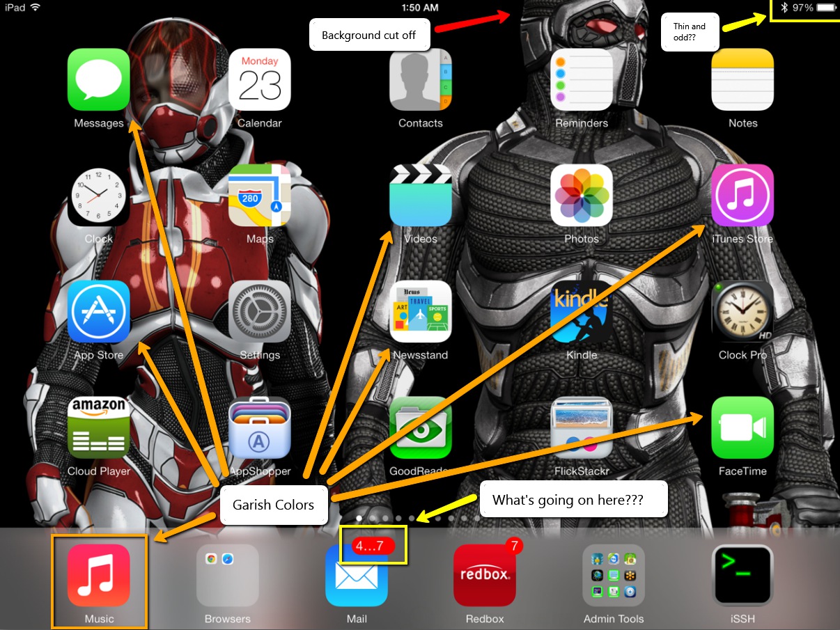
I’ll answer that question.. It’s when the OS flips back and forth between black and white screens. So, now not only do you have blinding white screens with garish colored fonts staring you in the face, now iOS has to flip between the solid white screens to solid black screens. Sure, there’s this fade transition thing, but it’s still overbearing and unnecessary. This is, in my estimation, one of the absolute worst design practices I’ve ever seen from any company. Who would ever design any application where one screen is almost solid white and the next is almost solid black. This is the absolute antithesis of good design. No graphical designer of any merit would even hint at let alone pitch such a stark transition between two elements.
An OS should be about experiences that let you get your work done. Not experiences that distract you from that purpose. If anything, the OS should blend into the background and facilitate getting the work done. Instead, the OS practically waving a red flag in your face and saying, “Here, look at me”.
Photos App is absolutely broken

When you’re just viewing photos, there’s this annoying white bar at the top of the screen that covers over the top 10% of the image. What’s that all about? I mean, can’t Apple software engineers figure out how to properly scale an image so it can be fully visible on the screen without being covered over by menu bars?
If you try to set wallpaper with the Photos app by scaling or sizing an image, be prepared for the whole app to lock up and possibly even cause your whole iPad to spontaneously reboot. This app is seriously unstable. Was this software even remotely beta tested? Once again, come on Apple. I can understand if something like Bob’s app was borked up, but the Photos app is pretty much a necessity. This has to be fixed and pronto.
And, to top it off, when you can manage to get the app not to lock the whole blasted iPad up when moving and scaling, it pushes 30% of the image off the top of the screen with no way to correct it. What crap!
Background Image movement effect
That new live motion background thing is the most worthless use of extra CPU cycles I’ve seen yet. The short and sweet of it is, let me turn it off. Don’t care about, don’t want it, don’t need it. And, the affect is so small it’s just pointless. I move my iPad 10 inches back and forth and the background moves maybe 1 pixel. Stupid waste of resources.
Lock and Unlock sounds no longer work.
Nuff said. [UPDATE] I kind of figured this one out. After the update to iOS7, these sounds are inexplicably disabled. However, if you go into the Sounds area in settings, you can turn it off and back on. This at least enables the lock sound. It does appear, though, that Apple has stripped the unlock sound from the system.
Carnival Colors
Where are we, Google? Seriously. I don’t want garish colors shining in my face at practically every turn. Some of the colors are almost like fluorescent green colors. It’s like, bad and ugly all at the same time. I don’t mind the flat look, but these colors seriously need to be muted down a whole lot.
Android Clone
Apple just ripped a page out of the Android book with IOS7, especially when it comes to the so-called streamlined fonts. This OS looks and feels more like Android than any other OS I’ve seen. We already have an Android. We don’t need another one. Do something original Apple. After all, that’s what you used to be known for. If I wanted to buy an Android tablet, I’d go buy one. I don’t want my Apple product to look and feel like an Android tablet. Of course, now we just need to wait for Google to file a lawsuit against Apple.
I’m hoping that Apple can get this quickly derailing train back on track soon with 7.0.1 as this thing called IOS7 is a hot mess. … and I thought IOS6 was bad.
Yahoo: When recycling is not a good idea
 After Marissa Mayer’s team recently decimated Flickr with its new gaudy and garish interface and completely alienated professional photographers in the process, her team is now aiming its sights on a new, but unnecessary, problem: recycling of long expired user IDs. Yahoo had been collecting user IDs for years. That is, people sign up and use the account for a while, then let the account lapse without use for longer than 30 days. Yahoo marks the ID as ‘abandoned’ (or similar) and then locks it out forever, until now. Some employee at Yahoo offered up the incredibly bad idea to recycle IDs. Unfortunately, this decision to recycle IDs may actually become the demise of Yahoo. Let’s explore.
Recyclables
I’m guessing that Yahoo has decided to make it look like it’s doing something good by recycling something, anything. That is, Yahoo is now letting people Wishlist long-closed user IDs that had been previously locked. Hurry, though, you only have until Aug 7, 2013 to wishlist that long forgotten ID. The trouble is, these old abandoned IDs are clearly second-hand goods. Let’s understand what exactly that means and why you really don’t want one (unless, of course, it was previously yours).
1) Obviously… Spam
Clearly, you aren’t asking for this old ID so you can jump onto that horrendous new Flickr interface or because you intend to read Yahoo News or OMG. The most obvious reason to want that ‘primo’ ID is for the email address. Unfortunately, you have no idea how that account was formerly used or what baggage might be associated with it! So, unfortunately, you will have no idea what exactly you’re getting into by re-using someone’s old ID. The person might have signed up for it just to divert tons of spam into it. Yes, this happens. That means, you could open the account and find it filled with spam in only 5-10 minutes, literally. Who’s to say someone wasn’t using it for illegal purposes and it was shut down for that purpose?
Yeah yeah.. Yahoo claims they will ‘unsubscribe’ the old ID from newsletters and so forth and these will have been ‘idle’ for at least 12 months (the first batch), but they’ve outlined no way in which they plan to accomplish this unsubscribe piece. Are they really going to hire a bunch of people to sit around clicking unsubscribe links and filling out unsubscribe forms? I think not. It’s all song and dance with no substance. Not to mention unsubscribing legitimate email subscriptions only accounts for about half (or less) of the total email volume that ends up in an inbox. So, don’t expect any miracles from Yahoo. If they can stop email, the best they can stop is about 40-50% at most. All of the rest will still show up merely by you having signed into your ‘new’ account.
A new email header?
Oh yeah, Yahoo is also trying to rush through the IETF RFC process a new header called require-recipient-valid-since that takes a date as an argument. This header basically requires marketers to know the exact acquisition date of every email address in their lists. Assuming email marketers know this date, which is a huge and incorrect assumption for Yahoo to make, when the email marketers send email containing this date, the email will supposedly end up in the correct account (or not) depending on the date. Because of this date header, that could lead real email to go missing or spam to show up. Unfortunately, as I said, this is an incorrect assumption. Most email marketers barely know the source of their leads, let alone when they acquired it. No, this date thing simply won’t work. And even then, this header will only work with email marketers willing to follow the rules. Spammers that don’t care won’t bother.
Worse, Yahoo is planning on handing out these newly freed old accounts in mid-August. Like every email marketing firm will simply drop whatever business plans they currently have to retool their applications to support this rushed and nearly useless header. Is Yahoo really that asleep at the switch?
2) Fraud, Account and/or Identity Theft
If you happened to have owned one of these long abandoned accounts or you otherwise lost your Yahoo account long ago, you’ll want to be very careful here. You can be guaranteed that there are already people scouting for popular long dead accounts to resurrect and phish for accounts, theft and identities. These thieves know that banks and other legacy institutions keep email addresses on file until you explicitly change them. Even then, they can have issues even updating this information in their systems even when you do request the change. So, someone who obtains a long dead account and then browses to Wells Fargo or Bank of America’s web site to request a password reset, they could abscond with your account credentials and your money assuming you still have (or ever had) any old Yahoo accounts hooked up to any financial accounts.
Yahoo claims to have ‘security’ mechanisms planned, but good luck with relying on that. I can’t even see that working. Granted, if banks fill in ‘require-recipient-valid-since’ with the appropriate acquisition date in every email they send, the banks can help prevent this issue (assuming the header works as expected). But, that also assumes the bank has an email address acquisition date to fill in this header. That also assumes that the bank can even roll out this header change in the time allotted before Yahoo starts doling these old IDs out. The clock is ticking and Yahoo hasn’t even gotten the RFC completed.
Fraud and identity theft is a very likely outcome of recycling old Yahoo accounts. If you’re reading this article and you have ever used a now-long-closed Yahoo ID for email, I urge you to go through all of your important accounts and make sure you have deleted all references to your old Yahoo email address immediately! Otherwise, some random person could come to own your old ID and can then cycle through sites requesting password resets just to find what sites your old ID may have used. This is the number one security threat that Yahoo can’t easily get around or easily address. Note, that a hacker who obtains an old ID only needs to get access to one of your accounts that will email your real plaintext password back to them and then they’ll work their way up to your bigger accounts. This is one of the biggest reasons this is an incredibly bad idea from Yahoo.
I’d also suggest that for any accounts you do have (i.e., Facebook, Gmail, etc), make sure to add alternative email addresses other than your Yahoo address for password resets and other security related emails. If you can, remove all your Yahoo addresses outright even if they are live. Use Gmail or Windows Live Mail instead (at least until they decide to go down this stupid ID recycling road).
3) Yahoo Mistakes
Ooops.. we didn’t actually intend to give away your live account. Sorry, ’bout that.
And then you’re stuck without an account. Yahoo is not publishing what accounts are under consideration specifically. They only say that these ‘dead accounts’ have been idle longer than 12 months in the first batch. Thereafter, any account that has been not accessed for 30 days is up for reissue consideration. There is nothing to say that Yahoo won’t make a mistake and re-issue a live and active account to some random person wbo signed up on the Wishlist. I can easily see this becoming one of the biggest blunders that Yahoo makes in this process. Unless the Yahoo staff is incredibly careful with this process, it would be super easy to accidentally give some random schmo access to an active live Yahoo account by mistake. For this reason alone, I’d consider closing out all of my Yahoo accounts except for one thing. They would recycle my account string name in 12 months (0r 30 days) and I’d be right back here in this situation again worrying about what of my other accounts were tied to this email address.
Basically, I can’t close my Yahoo account because it’s too great of a security risk. If I leave it open, I risk Yahoo accidentally giving it away in this stupid ‘wishlist’ process. It’s really a no-win situation. After Flickr, I have less and less trust in Yahoo and this is now leaving every Yahoo user in the lurch. This basically means you can NEVER EVER close your active Yahoo account if you want to keep your other accounts secure.
4) Missing Email
Even if you do manage to get your hands on one of these ‘prized’ IDs, Yahoo claims to be putting technical measures into place to prevent security issues. That could very well mean that for recycled accounts your mail delivery will be spotty, if it even works. Meaning, Yahoo may so heavily scrutinize emails heading to these recycled IDs that legitimate mail may simply never show up that’s been marked as ‘a security risk’. So, for emails like password resets to accounts, you may find that these emails simply never show up at all. Basically, anything that Yahoo’s email system construes as a security risk could simply just go missing. This is the most likely outcome of this recycling. Note that this problem could end up extending to every Yahoo account which could make Yahoo Mail a very problematic place for any email purposes.
Excess Baggage?
If after reading the above, you are still considering an ‘old used account’, I really can’t understand why. Taking on someone else’s old email and Yahoo baggage isn’t something I’d want to deal with (are they going to be sure to clear off all old comments and Yahoo answers for this old ID?). So, someone pops up from years past not knowing that Yahoo ID has been reissued and then you get some old boyfriend email, or someone who hated the previous owner of that ID. Then what? So, then you’ll be left with a mess to clean up. Why would you want to deal with this excess baggage when you can get a new account that’s never been issued and not have to deal with this problem at all? However, knowing that any account you create at Yahoo would be recycled later, how could you rely on it for any kind of security? You can’t. So, I might suggest Gmail or Windows Live Mail (or any other free email service not recycling IDs) instead of Yahoo.
Alternatives?
Unfortunately, I don’t see any other alternatives with Yahoo at this point. This is an incredibly stupid decision from Yahoo. I have no idea what the folks at Yahoo are even thinking. It’s not like a telephone number. You give that up and no one thinks twice that someone could use that old phone number nefariously. Unfortunately, nearly every site now uses email addresses to know if you ‘own’ your accounts. So, password resets, pin codes, and all manner of secure information traverses through email addresses.
One thing that Yahoo may inadvertently cause from this change is for Banks and other financial institutions to rethink how they validate a user’s identity. Clearly with this change, email addresses can no longer be trusted as secure or even know that it’s owned by only one person. This throws security surrounding email addresses into complete turmoil for any site that uses email addresses as validation.
Based on the previous paragraph, sites may start preventing use of @yahoo.com email addresses for their services. Knowing that you could lose your Yahoo account and then have it turned over to someone else 30 days later could easily lead to site compromises. To simply avoid this situation entirely, sites that rely on security may simply stop letting @yahoo.com email addresses sign up for service. So, one of the biggest benefits of using Yahoo Mail will end. I’d expect a mass exodus to Gmail or Windows Live Mail after the dust settles here. In fact, this decision may kill Yahoo Mail as any kind of a real email service. Does Marissa have any idea what the hell she’s doing? If I were on the Yahoo board, I’d be seriously considering right about now of ousting this one.
If I were in a position at Yahoo to make this decision, I would have killed this idea before I’d ever left the conference room. That Yahoo is even contemplating making this move at this time is completely questionable. Let’s just hope that when someone’s account is compromised and/or has identity theft as a direct result of this bad Yahoo decision, that someone will sue the pants off of Yahoo. That will at least teach other ISPs that this is not, in any way, an acceptable practice.
Risky Business
This decision has disaster written all over it. This is also a huge liability risk for Yahoo. Yes, Yahoo may have written in their Terms and Conditions that they have the right to reissue account names. But, since they hadn’t been doing this from the beginning and they’re now choosing to do this without proper preparations, this is a huge legal risk. It only takes a handful of users who’s accounts get compromised or who’s identities get stolen as a result of Yahoo’s new policy that this will end in courtroom dates. I can’t even fathom what benefit Yahoo derives from reissuing old IDs, but I can definitely see huge legal liabilities and black clouds looming over this now floundering company. In fact, the liabilities so outweigh the potential benefits to Yahoo, I have to completely question the purpose of this decision. Let’s hope Yahoo is all lawyered up as I can see the court dates piling up from this very very bad decision.
Microsoft Surface: Why Windows is not ready for a tablet
 Microsoft always tries to outdo Apple, but each time they try they end up with a half-baked device that barely resembles what Apple offers. Worse, the device barely even understands the purpose of why Apple created their product in the first place or even what space it fills in the market. But, leave it to Microsoft to try. Let’s begin.
Microsoft Surface
I’ve recently come into contact with a Microsoft Surface tablet. Let’s just dive right into the the heart of the problems with this platform. Windows and a touch surface are simply not compatible, yet. Why? We have to understand Window 8. For the release of Windows 8, Microsoft introduced Metro. This interface is a big tile based interface that is, more or less, touch friendly. It’s the interface that was adopted for use on both the Xbox 360 and Windows phones. The difference between Windows phone / Xbox 360 and Windows 8 is that you can’t get to the underlying Windows pieces on the Xbox 360 and Windows phone (and that’s actually a good thing). With Windows 8 on a tablet, unfortunately, you can. In fact, it forces you to at times. And, here’s exactly where the problems begin.
Windows 8 under the hood is basically Windows 7 slightly repackaged. What I mean is that Windows 8 is essentially Windows 7 when not using Metro. So, the window close button and resize button are the same size as Windows 7, the icons are the same size, the tiny little triangle next to a folder hierarchy is the same size. Easily clickable with a mouse. Now, imagine trying to activate one of those tiny little icons with a tree trunk. You simply can’t target these tiny little icons with your finger. It’s just not touch friendly. That’s exactly the experience you get when you’re using the Windows 8 desktop interface. When trying to press the close button on the Window, yet you might have to press on the screen two, three or four times just to hit the tiny little control just to make it activate. It’s an exercise in futility and frustration.
Metro and Windows
Metro is supposed to be the primary interface to drive Microsoft Surface. However, as soon as you press some of the tiles, it drops you right into standard Windows desktop with icons, start button and all. When you get dropped into this interface, this is exactly where the whole tablet’s usefulness breaks down. Just imagine trying to use a touch surface with Windows 7. No, it’s not pretty. That’s exactly what you’re doing when you’re at the Windows 8 desktop. It’s seriously frustrating, time consuming and you feel like a giant among Liliputians.
No, this interface is just not ready for a touch surface. At least, not without completely redesigning the interface from the ground up… which, in fact, is what I thought Metro would become. But no, many of the activities on the Metro screen take you out of Metro. This is the breakdown in usability. For a tablet OS, Metro should be it. There should be no underlying Windows to drop down to. If you can’t do it Metro, it cannot be done!
A Tablet is not a home computer, Microsoft!
The offering up multiple interfaces to the operating system is the fundamental design difference between IOS and Windows 8. Microsoft would have been smarter to take Windows phone OS and place that operating system straight onto Windows Surface. At least that operating system was completely designed to work solely with touch screen using 100% Metro. That would have been at least more along the lines of what Surface should have been. Instead, Microsoft decides to take the entire Windows 8 operating system and place it onto the tablet, touch-unfriendly and all. Is anyone actually thinking in Redmond?
In addition, putting full versions of Word, Powerpoint and Excel on Windows Surface might seem like a selling point, but it isn’t. The point to the iPad is to provide you with small lightweight applications to supplement what you use on a full computer. Or, better, Cloud versions of the apps. I understand the thinking that having a full computer as a tablet might be a good idea, but it really isn’t. Tablets are way too under powered for that purpose. That’s why notebooks and desktops are still necessary. The size of the processors in flat tablet devices just aren’t powerful enough to be useful for full-sized apps. That’s the reason why the iPad is the way that it is. Apple understands that an A6 processor is not in any way close to a full quad core i7 processor. So, the iPad doesn’t pretend to be a full computer knowing that it can’t ever be that. Instead, it opts to provide smaller light weight apps that allow simple communication, entertainment and apps that an A6 is capable of handling within the constraints of the limited ram and storage. That’s why IOS works on the iPad and why Windows 8 doesn’t work on Microsoft Surface.
Herky Jerky Motion
One of the other problems I noticed is that when you’re dragging around Metro’s interface and transitioning between Windows 8 desktop apps and back into Metro, there is this annoying stuttering jerky motion the screen does. It appears that this was an intentional design and not the graphics card going haywire. I’m not sure why this was let out of Redmond this way. Just from that problem alone, I first thought that Microsoft Surface tablet was having a problem. Then I realized that it wasn’t a tablet hardware problem. Indeed, that problem was inherent within Windows 8 and Metro. If you’re planning to offer a dragging, fading, transitioning experience, make it smooth. That means, no jerky shaky transitions. It makes the device seem under powered (it probably is). At the same time, it makes Windows look antiquated and unpolished (it definitely is).
Multiple Revisions
Microsoft always takes two or three product iterations before it settles into a reasonably solid, but second rate, product format. With the exception of the original Xbox, I don’t know of any single device that Microsoft has gotten right on the first try. It was inevitable that they would get the Microsoft Surface tablet wrong. If you’re looking to get into Windows 8, I’d suggest just going for a notebook outright. You’ll get more for your bang for the buck and you’ll have a much more usable Windows 8 experience.
I really wanted to like Windows Surface, but these fundamental problems with Windows prevent this tablet from being anything more than a clunky toy. The iPad actually has a use because the icons and screen elements are always big enough to tap no matter the size of the device. This is one of things that Apple fully understands about touch surfaces. Although, Apple could do with some nuanced improvements to touch usability. Unfortunately, when you get to the Windows 8 desktop interface, it’s a complete chore to control it via touch. I just can’t see buying a Windows Surface first version tablet. It tries to be too many things, but fails to be any of them.
Microsoft, figure it out!
Technology Watch: Calling it — Wii U is dead
I want Nintendo to prove me wrong. I absolutely adore the Wii U system and its technology. The Gamepad is stellar and it feels absolutely perfect in your hands. It just needs a better battery. The battery life sucks. There’s no doubt about it, the Wii U is an amazing improvement over the Wii. So what’s wrong with it?
Titan Tidal Forces
There are many tidal forces amassing against the Wii U which will ultimately be its demise. In similarity to the amazing Sega Dreamcast and, before that, the Atari Jaguar, the Wii U will likely expire before it even makes a dent in the home gaming market. Some consoles just aren’t meant to be and the Wii U, I’m calling it, will be discontinued within 12 months in lieu of a newly redesigned and renamed ‘innovative’ Nintendo console. Let’s start with the first tidal force…
What Games?
Nintendo just cannot seem to entice any developer interest in porting games to the Wii U, let alone creating native titles. With such big game franchises as Bioshock Infinite, Grand Theft Auto V, Saints Row 3 and Deadpool (Activision, surprisingly) side-stepping the Wii U, this tells me that at least Rockstar and Activision really don’t have much interest in producing titles for this console. Even such bigger titles like Call of Duty, which did make it to the Wii U, didn’t release on the same day as the PS3 and Xbox versions. Call of Duty actually released later, as did The Amazing Spider-Man.
Worse, Nintendo doesn’t really seem committed to carrying any of its own franchises to this console in any timely fashion. To date, there is still not even an announcement for a native Zelda for Wii U. Although, we’re not yet past E3, so I’ll wait to see on this one. My guess is that there will be a Zelda, but it will likely fall far shy of what it should or could have been.
Basically, there are literally no upcoming game announcements from third party developers. And there’s especially nothing forthcoming from the big franchises on the Wii U (other than Ubisoft’s Assassin’s Creed IV, which is likely to be just another mashup and rehash). Yes, there are a number of b-titles and ‘family’ titles, but that’s what Nintendo is always known for.
Sidestepped, but why?
I see titles like Grand Theft Auto V, Saint’s Row 3, Destiny and Deadpool where there is no mention of a Wii U version. For at least GTA5 and Saint’s Row, these developers likely had well enough of a lead time to be able to create a Wii U version. So, what happened? Why would these games not be released for the Wii U? I think it’s very clear, these developers don’t think they can recoup their investment in the cost needed to produce the game for that console. That doesn’t mean that the games won’t be ported to the Wii U six months after the Xbox, PS3 and PC releases. But then, what’s the incentive to play a 6 month old game? I don’t want to pay $60 for has-beens, I want new games to play.
Hardcore gamers want the latest at the moment when it’s released. Not six months after other consoles already have it. As a hardcore gamer, I don’t want to wait for titles to release. Instead, I’ll go buy the an Xbox or a PS so I can play the game when it’s released, not wait 6-9 months for a poorly ported version of the game.
Competition
With the announcement of both Sony’s PS4 (*yawn*) and the Microsoft’s Xbox One ( :/ ), these two consoles together are likely to eclipse whatever hope the Wii U has of gaining the hardcore gaming element. In fact, it’s likely that Sony’s PS4 is already dead as well, but that’s another story. Also, with the lackluster announcement of the Xbox One, we’ll just have to wait and see. Needless to say, people only have so much money to spend on hardware and only one of these consoles can really become dominant in the marketplace. For a lot of reasons to be explored later in this article, Nintendo’s Wii U cannot survive with the course it is presently on.
I can’t really call which is the bigger yawn, PS4 or Xbox One, but both have problems. Namely, no compatibility to previous console games which really puts a damper on both of these next gen consoles. Maybe not enough for either of them not to become successes in 5 years, but immediate adoption is a concern. Available launch titles will make or break these new consoles as backwards compatibility is not available. Meaning, without launch titles, there’s literally nothing to play (other than Netflix, which you can pay far less than the price of a console to get.. i.e., Roku). For competition alone, this is a huge tidal force against Nintendo that will ultimately keep the Wii U in third place, if not outright dead.
Let’s not forget the nVidia Shield based on Android that is as yet an unknown quantity. Although, the way it is currently presented with the flip up screen and the requirement to stream games to the unit from a PC is a big downer on the usability of this system as a portable. I don’t believe nVidia’s approach will succeed. If you’re a portable system, then it needs to be truly portable with native games. If you’re a console, then make it a console and split the functionality into two units (a controller and a base unit). The all-in-one base unit and controller, like the Shield, isn’t likely to be successful or practical. The attached screen, in fact, is 1) fragile and likely to break with heavy usage and 2) make it hard to play games because the screen shakes (loosening the hinge) when you shake the controller. For the PS Vita, it works okay. For the Shield that still requires a PC to function, this isn’t a great deal, especially at the $350 price tag.
Nintendo Itself
Nintendo is its own worst enemy. Because it has always pushed and endorsed ‘family friendly’ (all age) games over ‘hardcore’ (17+ aged) games, the Wii U has pushed Nintendo into an extremely uncomfortable position. It must now consider allowing extremely violent, bloody, explicit language games into the Wii U to even hope to gain market share with the hardcore 17-34 aged gamers. In other words, Nintendo finally has to grow up and make the hard decision. Is it or isn’t it a hardcore gamer system? Nintendo faces this internal dilemma which leaves the Wii U hanging in the balance.
It’s clear that most already released titles have skirted this entire problem. Yes, even Call of Duty and Zombie U do mostly. Assassin’s Creed III is probably the hardest core game on the system and even that isn’t saying much.
Game developers see this and really don’t want to wrestle with having to ‘dumb down’ a game to Nintendo’s family friendly standards. If I were a developer, I’d look at the Wii U and also ask, “Why bother?” Unfortunately, this is a catch-22 problem for Nintendo. Meaning, Nintendo can’t get people to buy the system without titles, but Nintendo can’t rope in developers to write software without having an audience for those titles. The developers just won’t spend their time writing native titles for a system when there’s not enough users to justify the expense of the development.
Worse, the developers realize they will also have to provide a ‘dumbed down’ version for the Nintendo platform to placate Nintendo’s incessant ‘family friendly’ attitude. For this reason, Nintendo can’t turn the Wii U into a hardcore system without dropping these unnecessary and silly requirements for hardcore games. Nintendo, as a word of advice, just let the developers write and publish the game as it is. Let the ratings do the work.
Bad Marketing
For most people, the perception is that the Wii U is nothing more than a slightly different version of the Wii. The marketing was all wrong for this console. Most people’s perceptions of this system are completely skewed. They really don’t know what the Wii U is other than just being another Wii. This issue is cemented by naming the system the ‘Wii U’. It should have had an entirely different name without the word ‘Wii’. Unfortunately, the Wii was mostly a fad and not a true long-lasting gaming system. It picked up steam at first not because it was great, but because people latched onto the group gaming quality. For a time, people liked the ‘invite people over for a party’ quality of the Wii. This group gaming quality was something no other gaming system had up to that point. Then came the Kinect and the Move controllers and competition wiped that advantage out.
The Wii U design has decidedly dropped the idea of group gaming in lieu of the Gamepad which firmly takes gaming back to a single player experience. Yes, the Wii U does support the sensor bar, but few Wii U games use it. Worse, the Wii U doesn’t even ship with the Wiimote or Nunchuk, firmly cementing the single player experience. Only Wii compatible games use the sensor bar for the multiple player experience. Because of the focus back to single player usage, this again says Nintendo is trying to rope in hardcore gamers.
Unfortunately, the marketing plan for the Wii U just isn’t working. The box coloring, the logo, the name and the way it looks seems like a small minimal upgrade to the Wii. Until people actually see a game like Batman Arkham City, the Amazing Spider-Man or Call of Duty actually play on the Wii U, they really don’t understand what the ‘big deal’ is. Worse, they really don’t see a need replace their aging Wii with this console knowing that they rarely play it at this point anyway. So, when the Wii U was released, the average Wii user just didn’t understand the Wii U appeal. The Wii U marketing just didn’t sell this console to either the family audience or to the hardcore gamer correctly.
Bad Controller Button Placement
The final piece of this puzzle may seem insignificant, but it’s actually very significant to the hardcore game player. Because the PS3 and the Xbox map action buttons identically to the controller across games, you always know that when you press A, it’s going to do the same thing on the Xbox or the PS3. So, you can move seamlessly between either console and play the same game without having so shift your button pressing pattern. In other words, you can play blind because the button location+action is identical between the Xbox and the PS3. The buttons placement is then as follows:
Y/Triangle = 12 o’clock, B/Circle = 3 o’clock, A/X = 6 o’clock, X/Square = 9 o’clock (Xbox / PS3)
The actions of Y and Triangle are the same between the systems. The actions of B and Circle are the same and so on. If you play Call of Duty on PS3 or Xbox, you always press the button at the 6 o’clock position to perform the same action.
The Wii U designers decided to place the buttons in opposition to the Xbox & PS3. The button placement for Wii U:
X = 12 o’clock, A = 3 o’clock, B = 6 o’clock, Y = 9 o’clock (Wii U)
This button placement would be fine if A (3 o’clock) on the Wii performed the same action as the B/Circle (3 o’clock position) on the Xbox and PS3. But, it doesn’t. Instead, because the Wii’s controller is labeled ‘A’ (3 o’clock position), it has the same function as the ‘A/X’ (6 o’clock position) button the Xbox and PS3. The ‘B’ button at (6 o’clock) matches the B/Circle (3 o’clock) on the Xbox/PS3. This means that you have to completely reverse your play on the Wii U and retrain yourself to press the correct button. This means you can’t play blind. This is a difficult challenge if you’ve been playing game franchises on the Xbox for 10 years with the Xbox/PS3 button and action placement. This would be like creating a reversed QWERTY keyboard so that P starts on the left and Q ends on the right and handing it to a QWERTY touch typist. Sure, they could eventually learn to type with keys in this order, but it’s not going to be easy and they’re going to hit P thinking it’s Q and such for quite a while.
For hardcore Xbox gamers, making the switch to the Wii U is a significant controller retraining challenge. When I replayed Assassin’s Creed III, I was forever hitting the button at the 6 o’clock position thinking it was the A button because that’s the position where it is on the Xbox and PS3. Same for the reversed X and Y. By the end of Assassin’s Creed III, I had more or less adapted to the Wii U’s backwards controller, but I made a whole lot of stupid mistakes along the way just from this button placement issue alone.
Either the games need to support Xbox/PS3 alternative action placement compatibility or the Wii U needs to sell a controller that maps the buttons identically to the Xbox and PS3. I personally vote for a new controller as it doesn’t require game designers to do anything different. This button placement issue alone is a huge hurdle for the Wii U to overcome and one that is a needlessly stupid design when you’re trying to entice Xbox or PS3 gamers to your platform. I don’t want to relearn a new controller design just to play a game. Ergonomics is key in adoption and this is just one big Nintendo ergonomics design fail. For the Wii, that button placement was fine. For the Wii U, the controller needs to identically map to the PS3 and Xbox button/action layout to allow for easy and widespread adoption.
Death of the Wii U
Unfortunately, due to the above factors, Nintendo will struggle to keep this console afloat before it finally throws in the towel to the Xbox One and the PS4. Worse, the Wii U really doesn’t have a niche. It lost its fad group gaming image over a year ago when people stopped buying the Wii for that purpose. Those who did use it for that shoved it into a closet. The Wii U may have been somewhat positioned to become a hardcore system, but due to poor controller button placement, lack of quality developers producing hardcore titles, the Wii U’s silly user interface, Nintendo’s antiquated ‘family friendly’ attitudes and Nintendo itself placing silly requirements on titles to reduce violence and language as part of that antiquated attitude, the Wii U doesn’t really have a market. It just doesn’t appeal to the hardcore gamers. So what’s left? Zelda and Mario and that’s not enough to invest in the Wii U.
Just looking at the titles presently available for the Wii U, at least 85% of which were original launch titles (most of which were ported from other consoles). In combination with the new fall console hardware releases plus hardcore titles for existing consoles that completely sidestep the Wii U, Wii U just cannot succeed without some kind of major miracle out of Nintendo.
I full well expect to hear an announcement from Nintendo dropping the Wii U, not unlike Sega’s announcement to pull the plug on the Dreamcast so early into its console life.
Flickr flustr: When design doesn’t meet function
 It’s not often I write multiple articles involving the same topic, but in this case I’m making an exception. I think it’s important to explore and understand the reasons why I believe this new Flickr interface change is such a failure. As a visual artist, I look at the new Flickr interface and wonder what the designers were thinking? See the image to the left. It’s clear the designers were not aware of the many ways that users use Flickr. Let’s explore.
Original Flickr Interface
The original Flickr design was compelling (if not dated) for many reasons and was also useful for many different purposes. The reason the original interface held up so well and for so long is because the original designer’s vision still held true even today, dated as it may seem. “Why has it held up?”, you ask. Let’s examine.
The images were spaced just far enough apart that the images, colors and shapes didn’t clash with one another. Image thumbnails were generally of the same size whether portrait or landscape. The page was centered leaving white borders on the sides giving well enough space for the eye to rest. There were limited numbers of photos per page keeping down the clutter. There was just enough information below each image to give the necessary details about the image (like a placard in a Gallery). From a management perspective, there was also just enough information to show how popular an image is and whether or not it has comments.
Basically, this original interface, while somewhat antiquated and dated, was still very functional on many levels. Both amateur and professionals alike could use and reference this interface for their own purposes. Amateurs could use it to store their snaps. Professionals could direct paying clients to their portfolio without image clashing or the interface being too busy. It was well designed from the beginning for many purposes and uses.
With this original interface, Flickr even began offering limited customization of the page layout such as images alone or images with sets on the left or other similar layouts. Yes, it was always limited customization and I had always hoped for more customization features to come.
New Flickr Interface
The new ’tile’ interface (which incidentally looks too much like Windows 8 Metro) removes nearly every pixel of white space and fills the entire page (edge to edge) with images. It unfairly penalizes portrait image thumbnail sizes over much larger thumbnails for landscape aspect images. So, you have huge landscape sized thumbnails immediately beside tiny sized portrait thumbnails. More than that, because it removes all white space from the page and fills the entire screen with images, there is no place for the eye to rest. It becomes one big jumbled mess of a screen that’s hard to view and even harder to concentrate on a single image. While the original interface design kept the images spaced far enough apart to let you focus on a single image, the new interface doesn’t. Instead, it forces your eye to constantly jump around to find something else to view. This makes the page too busy and way too cluttered.
Worse, when your eyes get tired of focusing on the images, they begin to focus on the white borders between the images. Because the white borders are of odd shapes and sizes, it begins to take on the motif of a badly copied Mondrian painting. In other words, the entire interface is one big cluttered busy mess. It’s not pleasant to view for any period of time. So, instead of taking time to visit a Flickr site in a relaxing way, many people will likely get eye fatigue fast and browse away from the entire Flickr site. The new site makes you want to look at something less tiring and less stressful. Art should be about the images, not the layout making you queasy.
Worse, in no way does this new interface say ‘professional’.
Polar Opposite Reactions
I hear a lot of people say they like the interface. My first initial reaction was also positive. But, that only lasted for a few moments until I realized the problems. I initially liked it because it was something new and a change, but I quickly realized that it wasn’t ‘better’. I hear many people saying that it’s the worst thing they’ve ever seen. That it’s horrible. So, why does this interface generate such polar opposite reactions from so many people? It’s because Flickr went from a general purpose interface appealing to a wide array of people to an interface that appeals to only a small subset of those people.
For a casual photographer who takes photos of their dog or baby or kids, it gives a really great at-a-glance image set to know what you have. This especially works well when the images are mostly the same or a series of similar shots. Also, for those people who like coffee table books of images, this is the next best thing to that. You can bring it up at home on your screen and show people your photo album at a glance. It’s much easier to see all your images at once with this interface. For casual use, these are the people I’d expect to like the new interface. It makes seeing the images easy and they’re accessible. In other words, it’s a little like Facebook’s gallery style. But, that doesn’t make it any less cluttered, busy or stressful to view.
For the professional photographer, the exact opposite is true. You do not want your images crammed up on the same page together like this. It’s busy, cramped, the images don’t flow properly, your eye can’t focus and doesn’t allow your clients to focus on each single image easily. It pits too many images against each other vying for attention. This is bad for a professional. Again, it’s just too busy and cluttered. You would never intentionally build a portfolio that looks this way. Why would you ever expect this from a site like Flickr? So, for professionals, this is the absolute worst interface that could have been built to show off professional photographs in a professional way.
The same above for professional photographers also holds true for visual artists. If Flickr were a gallery, it would now be one wall cluttered with hundreds of images. If I were hanging my art in a gallery, I would want them spaced far enough apart that they don’t clash or create the wrong message. I also would be allowed to place my art in the order of my choosing. Yet, at Flickr, the photostream is still limited to the order in which it was uploaded. This is something that should have been fixed long before rolling out this new interface.
The Interface Mistake
Flickr developers have completely lost touch with why the original interface worked for pretty much every use case. It worked because it offered something for every level of photographer, casual through professional including visual artists. It was by no means a perfect interface. After all, it needed a lot of improvements. But, it worked and it worked well. It was also on its way to becoming something better especially with the latest round of customization features added.
Because the Flickr developers just didn’t clearly understand the full amount of use cases, they developed this new interface that entices primarily just one use case, casual users. The people who snap their baby, their dog, their house or whatever else they can find around the house. These are those people who want an at-a-glance style interface that’s big, bold, cluttered and in-your-face. A virtual coffee table book, if you will. Or, in other words, the Facebookers.
Professionals and visual artists don’t want this. They don’t need this. It’s not professional. It’s not the way you want your photos represented to a potential client. It’s reminiscent of video game or a mobile device or Facebook. It’s not representative of a gallery exhibit or of a portfolio. This is where the Flickr developers have lost touch.
Flickr is a Gallery
The designers need to firmly understand that Flickr is a gallery. We are creative people supplying creative images to this gallery. It’s not a video game. It’s not a mobile device. It’s not Facebook. It is an image gallery. We want to showcase our images, not show them off like some kind of video game or toy or social network. Treat the images with respect, not as toys.
Because it is a gallery, customization is in order. The tile interface is fine as one theme among many display themes, but not as the sole theme for Flickr. Flickr needs to take a page from the WordPress book and offer multiple themes and styles. Let us choose how our images are showcased to our visitors. Yes, customization could easily become haphazard and random, but that’s the nature of customization. It has to. I don’t necessarily recommend allowing CSS level editing, but I do recommend that gallery themes become available. The time has long come for this Flickr feature. This feature is what Flickr developers should have been working on. The tiles theme, again, should have been one in among many different themes available to choose.
Don’t lock me into one single theme that doesn’t allow for customization. If I don’t like it, there’s nothing I can do except move my images elsewhere. Offer me choice. Let me choose my theme and my presentation to visitors. Flickr could have chosen this theme as the default theme, but then let us go into a theme selector and choose among 10-20 different gallery themes. Choice is the answer, not busy unprofessional Facebooky tiles.
Separate Management Interface
Because I’m the manager over my images, I don’t necessarily want to see the same interface that my visitors do when managing my images. I want a separate management interface that allows me to see and manage my images at a glance. I want easy, fast access to my comments, sets, collections, view stats and everything surrounding my images. I don’t need to fumble through the visitor experience only to expend extra time attempting to manage my images through a cluttered and busy interface. I want a clean concise management interface that users don’t see. It doesn’t really matter how pretty the management interface is as long as it’s functional for image management. Functionality is the key to image management.
The Fiasco
There were a number of mistakes made here. The developers did not do enough homework to understand why the original interface worked so well for so many use cases before rolling out the new interface. They refused to see just how narrow of a use case is the new interface. It really only appeals to one of many use cases. Additionally, Yahoo offered no preview. In other words, there was no beta test for users to give feedback before rolling it out site wide. Offering a preview window would have saved Flickr a lot of grief and is probably the single biggest mistake Flickr made in this whole update.
Developmentally, the mistakes they made included not offering customization. Users have been clamoring for such features as rearranging the image order of their stream. I agree, I would love to have this feature and have been waiting for it for a very long time. I would like to see other features regarding things like frames and virtual lighting. I’d like to have seen more Ajax features (easy drag and arrange). Users want more customization, not less. Instead, they locked every single user into a single interface experience that not only alienates most professional use cases, it also offers no customization to change things about the interface. In other words, Flickr has take a huge step backwards. The interface may appear more slick, but the lack of customization takes us back to a time well before Yahoo ever bought Flickr.
Then it comes to bugs. Instead of actually correcting existing bugs and misfeatures, they worked on changing the style of the main page leaving all of the existing bugs and misfeatures out there. Seriously, the most important thing is to make the landing page ‘pretty’? What about all of the features that were not complete or the bugs that were not fixed, or the features that were never added?
The final mistake, the treatment of Pro account holders. With the increase to 1TB of space and upload limits well increased, the need to purchase Pro is really no longer necessary. Those who recently purchased a Pro account this year feel cheated out of their money. And, rightly so. Yahoo didn’t live up to their side of the deal with the money given to Flickr for Pro accounts. Instead, Yahoo basically thumbed its collective noses at the Pro account users not only from the monetary perspective, but also from interface perspective. Basically, Yahoo just completely tromped all over the Professional photographers who bought into the interface for that use, but also those who paid into the Pro accounts that gave bigger limits needed to be a Professional user. Yahoo hasn’t even addressed this issue at all.
Yahoo has a lot of work to do to repair Flickr Pro user relationships. Unfortunately, it’s probably too late. Many Professional photographers are already migrating their imagery away from Flickr to alternative services that are, hopefully, more reliable and offer more professional interfaces and support.
Lacking Support
Through this whole ordeal, Flickr support has remained amazingly silent. They asked for comments and have said nothing about it. They did state they were ‘listening’ for whatever that’s worth. But, we all know that listening and doing are two entirely separate things. There should have been a lot more help and support coming from the Flickr staff after such an amazingly huge change. Yet, it appears that the Flickr team has rolled the interface out in a fire-and-forget approach. Basically, with a ‘this is it’ attitude given off by those who have been able to get hold of a support person.
Clearly, if this is the level of support that Yahoo / Flickr is providing to users for this type of service, it’s probably worth moving on to a service where your money will get you real support when you need it. Where the support people actually do care about making a difference and keeping the customer happy.
By the time Flickr realizes the problem and manages to correct it, it will probably be too late. It’s probably already too late.
Flickr’s new interface review: Is it time to leave Flickr?
 Yahoo’s Flickr has just introduced their new ’tile’ interface (not unlike Windows Metro tiles) as the new user interface experience. Unfortunately, it appears that Yahoo introduced this site without any kind of preview, beta test or user feedback. Let’s explore.
Tile User Experience
The tiles interface at first may appear enticing. But, you quickly realize just how busy, cluttered, cumbersome and ugly this new interface is when you actually try to navigate and use it. The interface is very distracting and, again, overly busy. Note, it’s not just the tiles that are the problem. When you click an image from the tile sheet, it takes you to this huge black background with the image on top. Then you have to scroll and scroll to get to the comments. No, not exactly how I want my images showcased. Anyway, let me start by saying that I’m not a fan of these odd shaped square tile interfaces (that look like a bad copycat of a Mondrian painting). The interface has been common on the Xbox 360 for quite some time and is now standard for Windows Metro interface. While I’ll tolerate it on the Xbox as a UI, it’s not an enticing user experience. It’s frustrating and, more than that, it’s ugly. So, why exactly Yahoo decided on this user interface as their core experience, I am completely at a loss…. unless this is some bid to bring back the Microsoft deal they tossed out several years back. I digress.
Visitor experience
While I’m okay with the tiles being the primary visitor experience, I don’t want this interface as my primary account owner experience. Instead, there should be two separate and distinct interfaces. An experience for visitors and an experience for the account owner. The tile experience is fine for visitors, but keep in mind that this is a photo and art sharing site. So, I should be able to display my images in the way I want my users to see them. If I want them framed in black, let me do that. If I want them framed in white, let me do that. Don’t force me into a one-size-fits-all mold with no customization. That’s where we are right now.
Account owner experience
As a Flickr account owner, I want an experience that helps me manage my images, my sets, my collections and most of all, the comments and statistics about my images. The tile experience gives me none of this. It may seem ‘pretty’ (ahem, pretty ugly), but it’s not at all conducive to managing the images. Yes, I can hear the argument that there is the ‘organizr’ that you can use. Yes, but that’s of limited functionality. I preferred the view where I can see view numbers at a glance, if someone’s favorited a photo, if there are any comments, etc. I don’t want to have to dig down into each photo to go find this information, I want this part at a glance. Hence, the need for an account owner interface experience that’s separate from what visitors see.
Customization
This is a photo sharing site. These are my photos. Let me design my user interface experience to match the way I want my photos to be viewed. It is a gallery after all. If I were to show my work at a gallery, I would be able to choose the frames, the wall placement, the lighting and all other aspects about how my work is shown. Why not Flickr? This is what Flickr needs to provide. Don’t force us into a one-size-fits-all mold of something that is not only hideous to view, it’s slow to load and impossible to easily navigate. No, give me a site where I can frame my work on the site. Give me a site where I can design a virtual lighting concept. Give me a site where I can add virtual frames. Let me customize each and every image’s experience that best shows off my work.
Don’t corner me into a single user experience where I have no control over look and feel. If I don’t like the tile experience, let me choose from other options. This is what Flickr should have been designing.
No Beta Test?
Any site that rolls out a change as substantial as what Flickr has just pushed usually offers a preview window. A period of time where users can preview the new interface and give feedback. This does two things:
- Gives users a way to see what’s coming.
- Gives the site owner a way to tweak the experience based on feedback before rolling it out.
Flickr didn’t do this. It is huge mistake to think that users will just silently accept any interface some random designer throws out there. The site is as much the users as it is Yahoo’s. It’s a community effort. Yahoo provides us with the tools to present our photos, we provide the photos to enhance their site. Yahoo doesn’t get this concept. Instead, they have become jaded to this and feel that they can do whatever they want and users will ‘have’ to accept it. This is a grave mistake for any web sharing site, least of all Flickr. Flickr, stop, look and listen. Now is the time.
Photo Sharing Sites
In among Flickr, there are many many photo sharing sites on the Internet. Flickr is not the only one. As content providers, we can simply take our photos and move them elsewhere. Yahoo doesn’t get this concept. They think they have some kind of captive audience. Unfortunately, this thinking is why Yahoo’s stock is now at $28 a share and not $280 a share. We can move our photos to a place where there’s a better experience (i.e., Picasa, DeviantArt, Photobucket, 500px, etc). Yahoo needs to wake up and realize they are not the only photo sharing site on the planet.
Old Site Back?
No, I’m not advocating to move back to the old site. I do want a new user experience with Flickr. Just not this one. I want an experience that works for my needs. I want an interface that let’s me showcase my images in the way I want. I want a virtual gallery that lets me customize how my images are viewed and not by using those hideous and slow tiles. Why not take a page from the WordPress handbook and support gallery themes. Let me choose a theme (or design my own) that lets me choose how to best represent my imagery. This is the user experience that I want. This is the user experience I want my visitors to have. These are my images, let me show them in their best light.
Suggestions for @Yahoo/@Flickr
Reimagine. Rethink. Redesign. I’m glad to see that Yahoo is trying new things. But, the designers need to be willing to admit when a new idea is a failure and redesign it until it does work. Don’t stop coming up with new ideas. Don’t think that this is the way it is and there is nothing more. If Yahoo stops at this point with the interface as it is now, the site is dead and very likely with it Yahoo. Yahoo is very nearly on its last legs anyway. Making such a huge blunder with such a well respected (albeit antiquated site) could well be the last thing Yahoo ever does.
Marissa, have your engineers take this back to the drawing board and give us a site that we can actually use and that we actually want to use.
Revert back to iTunes 10 from iTunes 11 (Mac Edition)
[UPDATE 2015-01-17] New Article: How to make iTunes 12 look and act more like iTunes 10
Thanks to Danny Rolnick for this very detailed and helpful explanation and for his permission to post it here on Randosity. His steps came in as a comment. However, because my previous Randosity article on this topic was clearly geared toward Windows, I thought this one deserved its own topic, especially as thoughtful and well written as his comment was. So, without further adieu, here is Danny’s very detailed explanation on how to rock and roll back to iTunes 10 from iTunes 11, if you’re using Mac OS X.
To go back to iTunes 10, I am happy to show you the way — By Danny Rolnick
I happily regard myself an expert now on how to downgrade iTunes 11 back to 10 on a Mac. Having found a straightforward and logical way of doing so, I thought it my duty to share with others. I can’t express what a relief it is to have version 10 back again. See the method at the bottom. Feel free to jump down there if you want to get started. Let me know how you got on in the comments below.
My view on the experience I have had of using iTunes 11
I have been a mac obsessed devoted fan all my life (I’m 46), never used a PC and got my first mac back in 1988. Until just the past few months I wouldn’t hear anyone say anything derogatory about anything Apple. However, a few things are rocking my ‘religious like’ devotion. Most of all, I have been dumbfounded about issues of the recent iTunes evolution in version 11.
I am also obsessed with music, movies and music videos. It’s not just a hobby – I am a DJ and Video DJ by profession. iTunes, since the very first release, has been the backbone of the way I organize and store all my digital media. I never had any need to seek an alternative and have also enjoyed the integration it provides with my iPhone and other iDevices etc etc.
My library is huge. I don’t mean to brag but aside from my digital music collection of 40,000 + tracks, either purchased from the iTunes store or imported from my CD collection, my music video collection is over 10,000. I am a proficient iTunes user and I often have reason to need to re-tag my files within iTunes or sometimes I use MetaX.
Until now, I have never resisted installing any available Apple updates and even feel some excitement in anticipation of the improved features. etc. iTunes version 11 has changed all that now. iTunes 11 is, without question, an inferior version to 10. Anyone who feels otherwise is probably only using iTunes in a basic way, and for this reason I have always thought there was a market for a pro version of iTunes for people like me.
iTunes 11 simply doesn’t work
I click to play a track, click again because it hasn’t started and click another time. Only then do I hear the track play. It takes ages to build links to external files, just as long as it takes to actually import them to the media folder. Tagging takes ridiculously long to the point you would need to leave the tagging to be done overnight. I could go on, but you are probably reading this because you have already experienced your own issues concerning version 11.
Before following the method below, I tried to seek alternatives to iTunes all together. I briefly tried Double Twist and Song Bird among many other software packages, but the truth is that iTunes is better for my personal purposes.
The most disappointing thing about version 11 is the silence from Apple about the obvious problems. It is this specific fact that has aggravated me so much. Maybe I am romanticizing, but I can’t help imagine that Steve Jobs would have ever let version 11 go as far as actually being released.
Steps to revert to iTunes 10 from iTunes 11
Here are the Stages and Steps for Mac OS X only. Thank you to Bogoss on MacForums for help with this article.
Stage 1 — Uninstall iTune11, Reinstall iTunes 10
Note: Any changes you have made to your music files since you used last used version 10 will be lost but any purchasses you have made in the time since can be downloaded again if you can’t find those purchasses in your media folder. If recently made playlists are of particular importance you could export the lists to somewhere for later.
- Back up your iTunes Folder(s) just in case.
- Download these apps
- AppZapper: http://appzapper.com (the free version will do).
- Pacifist: http://www.charlessoft.com.
- Download iTunes 10.7 (last version before 11). Check your download folder, it might still be there. You can also get it from the 10.7 Apple Support Web Site (Click the big download button)
- Using AppZapper, simply uninstall iTunes 11. Before you drag the iTunes icon from the Application folder to the window you will need to open the preferences of AppZapper and deselect the box next to “Keep Apple applications safe”
- Open the 10.7 dmg file, you will see the pkg file (usually you would double click it to install), but now, this time drag it out somewhere (e.g. Desktop).
- Open Pacifist
- Drag the pkg iTunes 10.7 file to Pacifist and then click install from the menu bar
- During installation, click replace every time a window pops up.
- Installation finished, iTunes 10.7 is back!
- Don’t open it yet!!!!
Stage 2 — Recover your Library
See this video that explains the process to recover your library here:
- In FINDER – go to your iTunes Music Folder located in (Your User Account)=>Music=>iTunes
- Within it, open the folder called Previous iTunes Libraries.
- Identify the most recent backup. It has the date at the end.
- Duplicate it. Move it to the desktop.
- Rename it as ‘iTunes Library.itl’. Basically remove the date from the file name.
- Go back to your iTunes Folder and rename the file there which is already named ‘iTunes Library.itl’ to ‘iTunes Library.itl.old’.
- Now move the ‘iTunes Library.itl’ file from your desktop to this location.
- Now open iTunes 10.7. If it can’t find your iTunes library, select choose library and navigate the application to the new ‘iTunes Library.itl’ file you created.
- Breathe a sigh of relief, you’re done!
- Copy this and post it to help others. Only come back to me to say Thanks, not for more support.
Danny


1 comment