WordPress: Gutenberg vs Calypso
 WordPress is a somewhat popular text blogging platform. It is, in fact, the blogging platform where this blog is presently hosted. This post is intended to offer up some background history of WordPress and where WordPress is currently heading (hint: not in a good direction). Let’s explore.
Original Editor — Circa 2003
When WordPress.com launched in 2003, a very basic text editor was included with the interface. This text editor was the defacto editor for the WordPress platform until around 2015, when Calypso launched. This very basic text editor was not HTML aware nor did it in any way support any advanced HTML features. As a WordPress user, you had to use trial and error methods to determine if the editor itself and the underlying submission syntax checker would allow any specific inline HTML or CSS features to be published.
This basic editor also did not support or even render such basic styling features like the application of styles like underline, italics or bold or even changing fonts and sizes. If you wanted to use these features within your article, you were forced to use hypertext markup to “wrap” lines of text with such formatting styles. This made editing and re-editing articles a chore because the editor itself did not render this markup at all, which meant you had to stumble over all of the markup when reading your article back. If you wanted to see the article fully rendered including these styles and markups, you were forced to preview the article in your WordPress theme.
In other words, a few markup features worked, but many, many did not. If you included hypertext markup in your article, you also had to know how to craft hypertext markup properly. You were then forced to test if the markup that you included would be accepted by the platform. This made crafting hypertext markup complicated, slow and required a huge learning curve. The editor itself showed you the entire article, markup and all, which made reading an article using this editor a complete pain in the ass. Note that this editor still exists in the platform as of this writing, through the wp-admin interface. It’s also still just as clumsy, antiquated and problematic as it always was.
This 2003 editor fares even worse today after you’ve edited an article in 2018’s Gutenberg, where Gutenberg crafts its blocks using a massive number of really ugly HTML comment and statements. It’s impossible to read an article’s text in among Gutenberg’s prolific and ugly markup when viewing it in such a basic editor. 2015’s Calypso, on the other hand, has tried to keep its markup limited, which served an author much better if you had to dive into HTML for any specific reason. Sometimes simpler is better!
Enter Calypso — Circa 2015
Around 2015, WordPress introduced a new editor called Calypso. This new editor at least supported basic live text style rendering; rendering that now allows you to see underline, italic and bold formatted live in the editor itself while writing. In essence, Calypso offered writers a similar experience as when using a software word processing product like Microsoft Word. Calypso even supported keyboard hotkeys to set these styles, making writing much easier.
No longer are you required to trip over ugly HTML markup statements. Limited hypertext markup is further included and is often rendered by the Calypso editor. Such rendered markup includes embedding images, YouTube videos and other basic multimedia inclusions like image slideshows. No longer did you need to go documentation hunting for the right WordPress tags to get this information included. This means that if you drop a link to a YouTube video in, the editor is aware that it’s a YouTube video and might render the video itself inline in the editor. The Calypso editor also crafted whatever HTML markup was needed to get this multimedia rendered properly. Early in the life of Calypso, YouTube UI rendering didn’t occur. It wasn’t until a few later releases that it began to render the videos in the editor. Advanced CSS styling and features, however, were mostly beyond the Calypso editor, but it can be included in an article by selecting “Edit as HTML” and manually adding it, as long as the syntax parser allows the syntax through. This situation pretty much exists today even with Gutenberg.
For about a 3-4 year period, WordPress was on the right track with the Calypso editor, making enhancements and bringing it up to date each year. Calypso was then a somewhat simplistic HTML editor, yes, but it was leaps and bounds better than the original WP Admin editor that was introduced in 2003. As a blog author, you were still forced to preview every article to make sure that it formatted properly in your site’s theme. Calypso’s performance as an editor is still unmatched, even today. Calypso launched and was ready to use in under 3 seconds when beginning a new article. Impressive! Very, very impressive!
The entire Calypso editor, while writing, remained speedy and responsive. In other words, if you typed 200 words per minute, the editor could fully keep up with that typing pace. Calypso didn’t then (and still doesn’t now) offer spell or grammar checking or perhaps some of the advanced features that would come to future editors, but not much in the blogging world at that time did. Though, these features could have been added to Calypso. Instead, WordPress.org had other not-so-brilliant ideas and then Gutenberg happened.
Enter Gutenberg — Circa 2018
In 2018, Gutenberg launches and replaces Calypso within WordPress.com. However, because Calypso had been so entrenched in the platform due to its adoption and use over those ~3 years, the Gutenberg team was more or less forced to continue supporting Calypso inside of the Gutenberg editor. The way the Gutenberg team managed this was by encapsulating the Calypso editor into what would become known as Gutenberg’s “Classic Block”. The inclusion of this block type is solely designed for backward compatibility with Calypso crafted articles.
Let’s postulate an insane request if WordPress had requested this action of bloggers after Gutenberg’s introduction. What if WordPress had required perhaps thousands of bloggers to check every article ever written for compatibility after auto-upgrading every article to Gutenberg blocks? Gutenberg’s article upgrade system has never worked very well at all. WordPress clearly wasn’t this level of insane to require this of its bloggers.
Once you also understand the ineptitude of the Gutenberg development team and how Gutenberg actually works (or doesn’t), you’ll understand why this didn’t happen and why it was simpler to integrate Calypso into Gutenberg’s Classic Block instead of asking every blogger to ensure their converted articles are still properly formatted. Yeah, if WordPress had required this step, the WordPress.com platform would have died. Thus, Calypso compatibility was built.
Gutenberg’s Misguided Design and Philosophy
Gutenberg was touted as a mixed media extravaganza for blogging, except for one thing. WordPress is STILL intended to be a text blogging platform. It’s not YouTube, it’s not Snapchat, it’s not Twitter and it’s not TikTok. You don’t need this type or level of multimedia extravaganza in a text blogging editor for the vast majority of blog posts. It’s useless and it’s overkill. Yet, the Gutenberg team blazed onward with its incredibly misguided development idea.
The need to embed graphics, YouTube, TikTok and other mixed media within a blog post is self-limiting, simply by the sheer fact that WordPress is still designed to be a written blog article platform. Embedding such mixed media might encompass 1-5% of the total volume of an article, mainly used to support written talking points, not as a primary blogging mechanism. I’m not advocating not adding these multimedia features, but I’m also not advocating that these features become the primary reason to make a new blog editor either.
The Gutenberg development team ultimately spent an inordinate amount of time over-designing and over-coding what is now essentially a technical replacement for cut and paste; the entire block design that Gutenberg touts. Cut and paste already exists. We don’t need a new way of doing it. Honestly, a replacement for cut and paste really IS the entire claim to fame for Gutenberg’s block system. Effectively, the Gutenberg block system was designed for ease of moving the blocks around… or at least, so we’ve been led to believe. In reality, moving blocks around is an absolute chore when attempting to use the up and down arrow controls. As a technical replacement for cut and paste, Gutenberg is an abject failure.
Further, even though Gutenberg touts its ability to work with WordPress themes, that feature has never properly worked and Gutenberg is not and has never been WYSIWYG (what-you-see-is-what-you-get). You would think that even though Calypso was never intended to offer WYSIWYG rendering, implementing a brand new editor in WordPress would offer this very important feature to bloggers. If you thought that, you’d have thought wrong. With Gutenberg, you are still forced to preview articles using your site’s theme to see the exact placement of everything. Gutenberg’s supposed use of themes is so basic and rudimentary that placement of almost anything, like even an image, almost never works in the same way as the theme’s placement.
However, Gutenberg’s main and biggest problem today is STILL its performance. Honestly, it’s one of the worst performing text editors I have ever used. The 2003 editor still outperforms than Gutenberg by an order of magnitude. If you’re writing a one paragraph one block article, Gutenberg might be fine. When you’re writing a 5,000 word blog article broken into maybe 50 or more blocks, by the final Paragraph Block, the input performance is so bad that the small flashing letter cursor lags behind keyboard input as much as 5 words (maybe even more based on your speed of typing). If you’re a 200 WPM typist with an even 1% error rate, good luck writing an article in Gutenberg. This lagging issue MUST have been apparent to the developers… unless they’ve tested nothing, which appears to be the case.
Gutenberg has failed at almost every design case it has tried to achieve! Calypso still outperforms Gutenberg in almost every single way, even when embedded in the “Classic Block”. It’s the entire reason I exclusively write using the “Classic Block” in WordPress.
Gutenberg doesn’t enhance the blogging experience at all. Just opposite, in fact. Gutenberg gets in your way. It’s slow. It gets worse. The Paragraph Block is so bare bones basic that it can’t even perform a simple spell check, let alone provide grammar checking. Yet, its input performance is so ironically slow for being as basic as it is. Honestly, both WordPress.com and WordPress.org (authors of Gutenberg) are deluded if they think Gutenberg is the answer to blogging. Calypso as an editor was way more useful and powerful than Gutenberg has ever been. Yet, here we are… stuck with this dog slow dinosaur that was foisted onto us unsuspecting WordPress bloggers.
Within 3 months of its release, Calypso’s dev team reduced its launch time from 10 seconds down to less than 3 seconds. In the nearly 6 years since Gutenberg’s launch, almost nothing has improved with Gutenberg, least of all its solid 15 seconds launch timing. You’d think that in nearly 6 years, the Gutenberg team could have made Gutenberg perform better along side adding important blogging features, like spell and grammar checking. Again, you’d have thought wrong. Of course, by all means let’s add embedding of YouTube videos in a block. But no, let’s not add spell or grammar checking to the Paragraph Block to enhance the entire reason why WordPress exists… writing. Oh no, let’s not fix the editor crashing which forces bloggers to reload the entire editor page and lose work that, you know, helps bloggers do the thing they’re here to do… write! By all means, let’s not fix the lag that builds up after 10, 50 or 100 blocks that lags input down to unbearable levels that prevents bloggers from doing the one thing they’re here to do… write!
No, instead let’s build useless block system, that technical replacement for cut and paste, that only serves to get in the way of blogging, slow everything down and serves to make the entire editor unstable. How many loss crashes can a blogger endure before realizing the need to write in an offline editor? Once this happens, what use is Gutenberg to WordPress?
I don’t know what the Gutenberg team is spending their time doing, but they’re clearly not solving these actual real usability problems within Gutenberg, nor by extension, attempting to enhance and extend WordPress as a text based blogging platform for us writers.
Calypso Lives On
Because the Gutenberg team was forced to retain Calypso within the Classic Block type in Gutenberg, it is the one and only one saving grace and shining light in among the darkness that is now Gutenberg. Without the Calypso editor’s continued availability within Gutenberg, this platform would be dead. Calypso is the sole and single reason why I can still use WordPress to write this article right now. Were I to use the Paragraph Block as the Gutenberg team has intended, instead of being maybe 90% of the way through this writing article at this point, I’d be 10% finished… spending all of that extra time fighting with the major input cursor lag, the hassle of block management and the continual lockups of the editor. Yes, Gutenberg randomly locks up hard when using the Paragraph Blocks, forcing the writer to reload the entire browser tab (and possibly lose some writing effort in the process). Calypso in Gutenberg’s Classic Block retains all of its snap, performance and stability that it formerly had when it was WordPress’s default editor back in 2015. I don’t have to worry about that silly Gutenberg block performance issue.
To this day, I still don’t know why WordPress thinks Gutenberg is better than Calypso… other than for the fact that a bunch of misguided developers spent way too much time coding something that simply doesn’t work.
In the name of brevity, I’m leaving out a WHOLE LOT of Gutenberg problems here; problems that if I were describe each and every one, this article would easily reach 10k to 20k words. I’m avoiding writing all of that because it’s a diversion which doesn’t help make this article’s point. Suffice it to say that everything Calypso had built as an editor was rebuilt into Gutenberg almost rote. Almost nothing new was added to Gutenberg to take Gutenberg beyond Calypso’s features.
Surly Gutenberg Developers and WordPress staff
I should mention that I’ve attempted interacting with the Gutenberg development team, spending my own time submitting valid Gutenberg bug reports to their official bug reporting site… only to be summarily harangued by their developers. When someone treats me with such disrespect, I don’t bother… a fact that I told one of those disrespectful developers. Time is way too short to spend it screwing around with ungrateful, surly people. Unfortunately, this ungrateful surliness has also made its way into the ranks at WordPress.com, in their leadership team and even on down into the support team.
For example, I asked for a feature to be submitted allowing the WordPress user to be able to choose their preferred block upon Gutenberg launch. Instead of actually agreeing and submitting the feature request, I got an unnecessary explanation of why the Paragraph Block exists in the way that it does.
Here is this Support Team member’s quote:
The Paragraph block is the default block in the WordPress Gutenberg block editor because it caters to the most fundamental and common use case when creating content: writing and structuring text.
And yet, the Paragraph Block performs the worst of any block in Gutenberg. If the Paragraph Block is that important of a block to Gutenberg, so important that it needs to be set as the default launching block, then why do we need all of these other more or less useless mixed media blocks? More importantly than this, if the Paragraph Block holds that level of importance to Gutenberg, why doesn’t it just work? If Gutenberg is supposed to revolutionize the blogging industry with its “new” mixed media approach, why can’t we set our default launching block to be something other than the Paragraph Block? No, WordPress, you can’t have it both ways.
It’s actually quite difficult for me not to hold that developer’s (and, by extension, WordPress staff’s) bad attitude against Gutenberg’s lack of quality. I still don’t understand why a developer would continue to write (bad) code for a project when they’re that disenchanted with writing it? It’s also not that this user’s bad attitude stemmed from my single interaction. Bad attitudes almost always originate internally and extend onto customer interactions. People who are that disenchanted with the products they are supporting probably need to find better jobs where the management team actually cares about the products they sell.
Design Failure
WordPress is a text-based blogging platform. There is no disputing this fact. However, the Gutenberg editor along with the Gutenberg team seem to want to rework this fact by adding Gutenberg’s strange mixed media features. In addition to the technical replacement for cut and paste along side these mixed media inclusions, one feature noticeably missing from Gutenberg is enhancements to the Paragraph Block itself, features that if added would majorly help in making writing simpler, easier and faster; with writing being the whole point to why WordPress exists.
For example, Google’s Gmail email editor has, for many years now, included grammar and spell checking via inline popup helpers. These helpers aid writers in crafting more professionally written articles. While the Gutenberg team was spending its lion’s share of its time crafting a technical replacement for cut and paste (its entire block system), Google spent its time helping writers to, you know, actually write. Even other platforms like Medium have drastically improved its own editors by helping writers to write better.
To this day (nearly 6 years after Gutenberg’s launch), the Paragraph Block still doesn’t offer grammar or spell checking built-in. Instead, the Gutenberg editor throws all of that back to the browser to handle. While Firefox does have a rudimentary spell checker built-in, it does not offer grammar checking at all. After all, Firefox is a generic web browser, not a writer’s tool, unlike WordPress and Gutenberg which are intended to be writer’s tools.
Unfortunately, the dictionary included in Firefox is also exceedingly basic and is missing many valid words. This means that it is, once again, left to the writer to determine if the red underline showing under a word is valid. Firefox does offer replacement suggestions, but only if you choose to right-click on the word, requiring active writer interaction. Once again, Firefox is not intended to be a writer’s tool, but WordPress and Gutenberg are! Yet, both WordPress and Gutenberg refuse to build the necessary tools to help writers write better. Instead, they offers us the questionable mix-media extravaganza editor with a poor technical replacement for cut and paste; an editor that isn’t even properly supported or managed and is broken more often that it works.
If Gutenberg is what we writers and bloggers get to look forward to for the next 6 years at WordPress, perhaps it’s time move to a different blogging platform. WordPress, word up!
↩︎
Rant Time: It’s time for Gutenberg to go.

As the title may suggest and as a WordPress.com blogger, I’ve given up using the Gutenberg editor for articles. Let’s explore exactly the reasons why.
Gutenberg, Block Editing and Calypso
One of the biggest selling points of Gutenberg (the latest WordPress editor, first released in 2018 and headed up by Matias Ventura) is its ability to have literal text blocks. Each paragraph is literally a square block that is separate from all other blocks. The blocks allow for movement with an arrow up and down. The point to this movement system is to allow for easily rearranging your articles. At least, that was the main selling point.
In reality, the blocks are more of a chore than a help. I’ll explain this more in a bit. When Gutenberg first launched, it replaced the previous editor, Calypso, which was released in 2015. Calypso loaded extremely fast (in under 3 seconds you’re editing). Typing in text was flawless and simply just “worked”. When Calypso first released, there were a number of performance issues, some bugs and it didn’t always work as expected. However, after several updates over the initial months, all of that was solved. The slowness and performance issues were completely gone.
Before Calypso arrived, there was the much older “black colored” editor that was simple text-only editor. Meaning, there was no ability to graphically place or drag-move objects. Instead, you had to use specific HTML tags to manually place images and use inline CSS to get things done. It was a hassle, but it worked for the time. The big update for WordPress was that Calypso would bring modern word processor features and a more WYSIWYG type experience to blogging. Calypso did that exceedingly well, but in an occasionally limited way.
Unfortunately, Calypso had a short lifespan of about 3 years. For whatever reason, the WordPress.org team decided that a new editor was in order and so the Gutenberg project was born.
Gutenberg Performance
The real problem with Gutenberg is its performance. Since its release, Gutenberg’s block-building system has immense overhead. Every time you type something into a block, the entire page and all blocks around it must react and shift to those changes. Performance is particularly bad if you’re typing into a block in the middle of an article with many other blocks. Not only does the editor have to readjust the page on every single keystroke entered, it has to do it both up and down. Because of this continual adjustment of the page, keystrokes can become lagged by up to 12 seconds behind the keyboard typing.
Where Calypso’s typing performance is instant and without lag, Gutenberg suffers incredible lag due to its poorly conceived block design. Gutenberg has only gotten worse over time. Unlike Wine which ages and gets better every day, Gutenberg gets worse every day. There are literally hundreds of bugs in the Gutenberg editor that have never been corrected, let alone the aforementioned severe performance issue.
Classic Editor
You might be asking, “What editor are you using?” Technically, I’m using Calypso inside of Gutenberg because there’s no other option than the antiquated “black editor”. When Gutenberg came about, they had to find a way to make old articles written in Calypso compatible with Gutenberg without having to convert every single article into the new Gutenberg block format. To do this, the Gutenberg team included Calypso in the block called the “Classic Editor” block. It’s effectively a full version of Calypso in a single block.
The Classic Block type is what I’m now using to type this and all new articles. I must also say that every character I type into the Classic Block is spot on in speed. No lags at all. Typing is instantaneous. However, with Gutenberg, typing words into a Gutenberg “paragraph” block can see text show up literally many seconds after I’ve typed it… sometimes more than 10 seconds later. I can literally sit and watch the cursor make each letter appear after I’ve stopped typing. It’s incredibly frustrating.
Few typists are 100% accurate 100% of the time. This means using the backspace key to remove a double tapped letter, add a missing letter or rewrite a portion of text is required. When you’re waiting on the editor to “catch up” with your typing, you can’t even know what errors you made until it finally shows up. It’s like watching paint dry. It’s incredibly frustrating and time wasting.
Editor Performance
Gutenberg’s performance has gotten progressively worse since 2018. By comparison, Calypso’s launch performance suffered when it was first released, taking 10-12 seconds to launch. The Calypso team managed to get that under control within 6 months and reduced the launch time to under 2 seconds. Literally, you could go from a new browser tab to editing an existing or brand new article in under 2 seconds. Gutenberg’s launch performance has remained consistent at ~10 seconds and has never wavered in the many years since it launched in 2018. And… that 10 seconds all for what? An editor with horrible performance?
Gutenberg launched with “okay” block performance years ago, but in the last 6 months, its performance level has significantly degraded. Literally, the Gutenberg paragraph block, the mainstay of the entire Gutenberg editor, is now almost completely unusable in far too many circumstances.
If you’re looking to type a single short paragraph article, you might be able to use Gutenberg. Typing an article like this one with a large number of paragraphs of reasonable length means slower and slower performance the longer the article gets, especially if you need to edit in the middle of the article. That’s not a problem when using the Classic Block as the article has only one block. It’s when there’s an ever growing number of blocks stacking up that Gutenberg gets ever slower and slower. Gutenberg is literally one of the most horrible editing experiences I’ve ever had as a WordPress blogger.
Gutenberg’s Developers
As a user of Gutenberg, I’ve attempted to create bugs for the Gutenberg team in hopes that they would not only be receptive to wanting these bug reports, but that they would be willing to fix them. Instead, what I got was an ever growing level of hostility with every bug reported… culminating in myself and one of the Gutenberg developers basically having words. He accused me of not taking the right path to report bugs… but what other path is there to report bugs if not in the official bug reporting system devoted to Gutenberg’s bugs? This one entirely baffled me. Talk about ungrateful.
Sure, I’m a WordPress.com user, but the WordPress.com team doesn’t accept bug reports for Gutenberg as they have nothing to do with Gutenberg’s development. They’ll help support the WordPress.com product itself, but they don’t take official bug reports for sub-product components. In fact, I’d been told by multiple WordPress.com support staffers to report my bugs directly into the Gutenberg project bug reporting system. That’s what I did. I explained that to the developer who suddenly became somewhat apologetic, but remained terse and condescending.
Let’s understand one thing. WordPress.com is a separate entity from the WordPress.org Gutenberg development team. The two have no direct relationship whatsoever, making this whole situation even more convoluted. It’s a situation that WordPress.com must workout with WordPress.org. As a blogger, it’s not my responsibility to become the “middle man” to communicate between these orgs.
Any development team with this level of hostility towards its end users needs to be reevaluated for its project values. Developers can’t develop in a bubble. They need the feedback from users to improve their product. Developers unwilling to accept this feedback need to be pulled from the project and, if their attitude does not improve, be jettisoned. Bad attitudes need to be culled from any development project. It will only serve to poison the end product… and nowhere is this more abundantly clear than in the Gutenberg editor. This editor is now literally falling apart at the seams.
WordPress.com is at a Crossroads
At this point, WordPress needs to make a choice. It’s clear, the Gutenberg editor can’t last. WordPress.com must make a new editor choice sooner rather than later. Gutenberg is on its last legs and needs to be ushered out of the door.
If that means re-wrappering the entire editor so that the Classic Block becomes the only and default block available, then so be it. I’d be perfectly happy if WordPress.com would make the Classic Block not only the default editor block type when entering a new editor, but the ONLY block type available. After all, everything that can be done with individual blocks in Gutenberg can be done in the Classic Block.
Then, refocus the Gutenberg development team’s efforts to improving ONLY the Classic Block. Have them drop the entirety of development for every other block type from that horrible Gutenberg editor product.
Blocks and Gutenberg
Let’s talk about Gutenberg’s design for a moment. The idea behind Gutenberg is noble, but ultimately its actual design is entirely misguided. Not only has Gutenberg failed to improve the editor in any substantial way, it has made text editing slower, more complex and difficult in an age when an editor should make blogging easier, faster and simpler. All of the things that should have improved over Calypso have actually failed to materialize in Gutenberg.
The multiple block interface doesn’t actually improve the blogging experience at all. Worse, the overhead of more and more blocks stacking to create an article makes the blogging experience progressively slower and less reliable. In fact, there are times when the editor becomes so unresponsive that it requires refreshing the entire editor page in the browser to recover. Simply, Gutenberg easily loses track of its blocks causing the editor to essentially crash internally.
None of this is a problem with the Classic Editor block because editing takes place in one single block. Because the Classic Editor is a single block, Gutenberg must only keep up with one thing, not potentially hundreds. For this reason, the Classic Editor is a much easier solution for WordPress.com. WordPress.com need only force the Classic Block as the primary editor in Gutenberg and hide all of the rest of Gutenberg’s garbage blocks that barely work. Done. The editor is now back to a functional state and bloggers can now move on with producing blog articles rather than fighting Gutenberg to get a single sentence written. Yes, Gutenberg is that bad.
Bad Design
Worse, however, is Gutenberg’s block design idea. I really don’t fully understand what the Gutenberg team was hoping to accomplish with this odd block design. Sure, it allows movement of the blocks easily, but it’s essentially a technical replacement for cut and paste. How hard is it really to select a paragraph of text, cut it and then paste it into a different location? In fact, cut and paste is actually easier, faster and simpler than trying to move a block. Block movement is up or down by one position at a time when clicked. If you need the block moved up by 10 paragraphs, then you’re clicking the up button 10 times. And, you might have to do this for 5 different paragraphs. That’s a lot of clicking. How does that much clicking save time or make blogging easier? Cut and paste is always four actions. Select the text, cut, click cursor to new location, paste. Cut and paste has none of this click-click-click-click-clickity-click BS. Of course, you can cut and paste a whole block, but that sort of defeats the purpose of building the up and down function for movement, doesn’t it?
Instead, I’ve actually found in practice that Gutenberg’s alleged more advanced “design” actually gets in the way of blogging. You’d think that with a brand new editor design, a developer would strive to bring something new and better to the table. Gutenberg fails. The whole cornerstone and supposed “benefit” of Gutenberg’s design is its blocks. The blocks are also its biggest failing. Once you realize the blocks are mostly a gimmick… a pointless and a slow gimmick at that, you then realize Calypso was a much better, more advanced editor overall, particularly after using a Classic Block to blog even just one article.
Change for Change’s Sake
Here’s a problem that’s plagued the software industry for years, but in more recent times has become a big, big problem. With the rush to add new features, no one stops to review the changes for functionality. Product managers are entirely blinded by their job requirement to deliver something new all of the time. However, new isn’t always better and Gutenberg proves this one out in droves. Simply because someone believes a product can be better doesn’t mean that the software architects are smart or creative enough to craft that reality.
We must all accept that creating new things sometimes works and sometimes fails. More than that, we need to recognize a failure BEFORE we proceed down the path of creation. Part of that is in the “Proof of Concept” phase. This is the time when you build a mini-version of a concept to prove out its worth. It is typically at the “Proof of Concept” stage where we can identify success or failure.
Unfortunately, it seems that many companies blow right past the proof-of-concept stage and jump from on-paper design into full-bore development efforts. Without a proper design review by at least some stakeholders, there’s no way to know if the end result will be functional, useful or indeed solve any problems. This is exactly where Gutenberg sits.
While I can’t definitively state that the Gutenberg team blew past the proof-of-concept stage, it certainly seems that they did. Anyone reviewing Gutenberg’s blocks idea could have asked one simple question, “How exactly are blocks better than cut and paste?” The answer here is the key. Unfortunately, the actual answer to this question likely would have been political double-speak which doesn’t answer the question or it might end up being a bunch of statistical developer garbage not proving anything. The real answer is that this block system idea doesn’t actually improve blogging. In fact, it weighs down the blogging experience tremendously.
Instead of spending time writing, which is what we bloggers do (and actually want to do), we now spend more time playing Legos with the editor to determine which block fits where. As a blogger, an editor should work for us, not against us. Spending 1/3 of our time managing editor blocks means the loss of 1/3 of our time we could have been writing. Less time writing means less articles written.
Because blogging is about publishing information, speed is of utmost importance. Instead of fumbling around in clumsy blocks, we should spend our time formulating our thoughts and putting them down onto the page. For this reason, Gutenberg gets in our way, not out of our way.
At a Crossroads — Part II
Circling back around, we can now see exactly WHY WordPress.com is at a crossroads. The managers at WordPress.com need to ask this simple question, “What makes our bloggers happy?” The answer to this question is, “A better and faster editor.”
Are Gutenberg’s failings making bloggers happy? No. Since the answer to this question is “No”, WordPress.com managers need to realize there’s a problem afoot… a problem which can be solved. Nothing requires the WordPress.com platform to use Gutenberg… or at least the block portions of it. Because there exists a solution in the Classic Block, it would be simple to launch Gutenberg directly into a locked-in version of the Classic Block and not allow any further blocks to be created… essentially dumping the vast majority of Gutenberg.
This change reverts the editor back to Calypso and effectively does away with Gutenberg almost entirely. Though, this is a stop-gap measure. Eventually, the WordPress.com managers will need to remove Gutenberg entirely from the WordPress.com platform and replace it with a suitably faster and more streamlined editor, perhaps based on a better, updated version of Calypso. It’s time for this change. Why?
If the Gutenberg team cannot get a handle on crafting an editor that works after 3 years, then Gutenberg needs to be removed and replaced with an editor team actually willing to improve the blogging experience. WordPress.com needs to be able to justify its sales offerings, but it’s exceedingly difficult when you have what should be the cornerstone of the platform, the editor, working against you. This makes it exceedingly difficult for new would-be buyers to literally spend money for WordPress.com platform. Paying for an editor that barely works is insane. WordPress.com managers can’t be so blind as to not see this effect?
The bottom line is, how do you justify replacing an editor with an under 2 second launch time with an editor that now has a 10-20 second launch time? That’s taking steps backwards. How do you justify an editor that lags behind the keyboard typing by up to 12 seconds when the previous editor had no lag at all? Again, steps backwards. Isn’t the point in introducing new features to make a product better, faster and easier? Someone, somewhere must recognize this failure in Gutenberg besides me!! Honestly, it’s in the name of the product “WordPress”. How can we “press words” without an editor that “just works”?
Grammar and Spell Checking?
One final extremely sore point with Gutenberg is that in the years since Gutenberg’s launch, the Gutenberg team has been entirely unable to add truly useful blogging features. For example, Google’s Gmail product has had both spell and grammar checking WITH popup suggestions for years. When writing, it’s easy to mistype and double word, particularly across line breaks. Yet, Gutenberg’s Paragraph block is STILL as bare-bones-basic as the day it was built, it can’t check for anything written inside of it. Without such features, bloggers using WordPress are now forced to use outside software to write and then copy and paste the entire article into Gutenberg ready to go. Being forced to use an outside editor entirely negates the point of using Gutenberg at all!
WordPress.com, hear me, it’s time to make a change for the better. Dumping Gutenberg from the WordPress.com platform is your best hope for a brighter future at WordPress.com. As for the WordPress.org team, let them waddle in their own filth. If they want to drag that Gutenberg trash forward, that’s on them.
↩︎
WordPress Review: Gutenberg Editor

This will be a no hold’s barred review of using the “new” Gutenberg editor in WordPress.com (and WordPress of any install). Let’s explore.
Calypso
Several years ago, WordPress introduced the then “new” Calypso editor. It had a blue-ish color style and was a straight up type of no-frills editor. It had some flaws, to be sure, but it worked well.
About 2 years ago, along comes the newest new editor named Gutenberg. This editor was thought to be intended as a what-you-see-is-what-you-get (WYSIWYG) editing experience. Well, let me just say straight up and flat out, it isn’t. Yes, this review will be very critical of this editor. I generally refrain from reviewing my blogging platform, but in this instance I felt compelled and justified to review this editor and its massive set of usability and ergonomic flaws.
Gutenberg
Several years ago, the Gutenberg project started. This editor was intended to be the eventual replacement for Calypso. ‘Eventually’ has arrived and the hour for replacement is at hand. Yet, Gutenberg is still not yet prime time ready. It is so far from being prime time ready, I can’t even adequately justify how badly it isn’t ready. Where Calypso had some flaws, these were easily overcome with a small amount of fiddling.
With Gutenberg, fiddling takes minutes at a time (and many times way longer) and sometimes there aren’t even ways to address the problems inherent in this new editor.
Let me start by addressing Gutenberg’s positive features before I get down into the nitty gritty problems with it.
Gutenberg’s Benefits
I want to make sure to cover both the positive and negative sides of the Gutenberg editor so that I’m not called out for unfairly representing this editor. With that said, let’s get going. Gutenberg’s positives include:
- Block editing capabilities
- Some additional text styling options (superscript, subscript, etc)
- Not much else of note.
Block editing is pretty much where Gutenberg’s positives end. Block editing doesn’t greatly enhance the blog editing experience and, at the same time, Gutenberg adds an unnecessary layer of complexity to Calypso’s formerly simple editing design.
What does block editing do for the blogger exactly? It allows you to more easily move blocks around within an article. That’s pretty much its claim to fame. Though, I don’t see how that really buys much when most computers today offer copy and paste capabilities that allow this same functionality through drag, highlight, cut and paste. The fact that they spent gobs of time designing a new editor solely to solve a perceived copy-paste problem (that doesn’t really exist) speaks volumes of this editor’s design goals.
Gutenberg’s Drawbacks
There are many. First, the width of the editor is too narrow. Calypso had an editor width far greater than Gutenberg. This means that Gutenberg is not in any way a WYSIWIG design. Second, you must still preview your document… which in and of itself says that Gutenberg is NOT a WYSIWIG design.
Basically, Gutenberg’s team redesigned an editor for no reason at all. It was simply a new design to be a new design, but not to solve any actual editing problems. In fact, they’ve introduced new problems where in Calypso’s editor they didn’t exist.
For example, the bottom status bar in Calypso showed us the word count and other pertinent document information front and center. We didn’t have to click into or move our mouse to get to this information. Yet, in Gutenberg, this information is now hidden behind an icon that 1) makes no sense and 2) now requires active effort on the part of the blogger.
The block editing system also fairs just about as well (or not, depending on your point of view). There are a number of block types like paragraph, heading and image with an additional array of way lesser used block types like Star Rating, Highlighter, Quote and Pullquote.
As I said, the team has made this editor unnecessarily more complicated without the need to be this complicated. A text editor, in fact, should be much more simple, friendly, fast and easy. Many of these functions were handled in Calypso more elegantly, by highlighting text, then clicking to apply an attribute to that text. Basically, 1-2-3. In Gutenberg, you have to create a new block type by clicking many times, then placing that specific text into that block type.
Whoops! You chose the wrong block type? There’s almost never a way to convert from one to another. You must copy the content out, create a new block, and paste it in. Even then, sometimes copy and paste won’t work.
So, here’s where the block difficulties begin. Because blocks are now discrete elements within the body of the article… think of them as <div></div> sections, it’s difficult to get exact placement. In fact, trying to style any of these blocks using inline CSS is almost impossible. With Calypso, the text was straightforward and could be easily styled within the body of the article. In Gutenberg, if you want complex style options, you’re forced to use the Classic Block, which is effectively most of Calypso in a block. By being forced to use the Classic Block, you’ve pretty much negated the reason to even use Gutenberg in the first place.
That’s not to say you can’t style within Gutenberg, but it’s more about what happens after you do it. When you go into the HTML and muck about with styling of the paragraphs, Gutenberg’s parser typically fails to understand this HTML CSS addition and forces conversion of the entire block into HTML with no more instant preview available. Now you’re stuck viewing this individual block as ugly HTML forever. If you want to see what it will look like in the actual article, you must click ‘Preview’. Calypso happily and fully rendered in-line CSS and still allowed a preview. It never once balked at adding in-line CSS, though it might strip it out if it didn’t like what you did. This is one of Gutenberg’s biggest failures. Blogging is driven by HTML. Styling HTML with CSS is probably one of the simplest things you can do… yet Gutenberg can’t even understand simple CSS styling? Yeah, that’s a #fail.
For styling images and placing them in very specific locations within Gutenberg block articles, here’s where Gutenberg again fails. While you can create an image block and it auto-wraps text, there is no exact placement or altering margins of white space around the image block within Gutenberg. If you want exact placement or specific spacing for the text wrapping around your image, you must again revert to using the Classic Block. Again, another of Gutenberg’s failures.
If you’re going to spend time creating a complex block editing system, you’d think that exact placement of blocks in space within the document (i.e., drag and drop) would have been part of the design. Unfortunately, you’d have thought wrong because this aspect of Gutenberg simply doesn’t exist. There is no drag and drop or exact placement here.
What exactly is Gutenberg then?
That’s what I keep asking myself. Reinventing the wheel without actually offering us something new, improved and innovative is a questionable design choice. In fact, because of the overreaching complexity introduced by Gutenberg into a platform that should be all about simplicity is, again, questionable. WordPress has always been about making it easy and simple to blog. This convoluted, complex and difficult to manage editor only serves to make the blogging experience more difficult, not easier.
I’m not saying Calypso is a perfect editor by any stretch. Hardly. Calypso has a fair number of problems that also need to be addressed. Unfortunately, that editor’s updates had been abandoned about to the time the Gutenberg team started up. This left Calypso mostly unfinished, yet still reasonably simple to use and definitely easier to manage an article’s overall content.
Complexity
I keep talking about unnecessary complexity. Let me expound on that. Part of the complexity of Gutenberg stems from the block system itself. The fact that we now have to select a specific block type, not really knowing what each do in advance, means we now have to understand the block’s features and their usefulness. That means trial and error. That means a learning curve. That also means needing to understand the limitations of this new unfriendlier editing system.
Yes, it goes deeper than this. The blocks themselves, as I said, are discrete separate entities. You can’t embed one block within another. For example, you can’t make a block quote show up word wrapped next to basic text within your article. An example of a block quote block type is immediately below:
This is a block quote
forces a citation
Unfortunately, a block quote must sit in that position where it is. It can’t be moved into a wrapped position within another block (like an image). You’d think that this kind of innovation would be possible in a new editor. Unfortunately, no. Worse, as you’ll notice, this paragraph is too closely abutted next to the block quote. With Gutenberg, you can’t fix this horrible spacing issue. There’s no way without using inline CSS styling. If you attempt to use inline CSS styling, the entire block may be forced into HTML mode leaving no way to preview the block in the editor.
Now begins a Classic Block.
This is a block quote
The block quote in the classic block doesn’t force a citation footer, leaving much more white space without leaving this paragraph feeling so cramped. Remember, white space is your friend.
Let’s talk about images and placement
To place an image using Gutenberg, this is what you get. You can align left, center or right.

Here is a paragraph next to an image using blocks. You can word wrap next to an image, but you can’t change the spacing of the text around the image.
In a Classic Block, I can style the image to add margin-left and margin-right to change the spacing next to the words. I can’t do this in Gutenberg’s blocks.
Unfortunately, using Gutenberg to perform image wrapping has some unnecessary complexities. There’s no way to ensure that the block just below it is separate. Instead, it wants to pull up and wrap that block too. There’s no way to make sure that the block just below the image doesn’t wrap. Gutenberg attempts to wrap everything. With Calypso, this editor has more fine grained control over this problem because you can add HTML pieces that enforce this.
 Here begins a Classic Block with some text and an image. I’m writing just enough text here so that I can insert an image and do word wrapping around the image. Keep in mind that a classic block is basically Calypso in a block.
As you can see, this image has more space to the right of it. I styled this image with a margin-right CSS tag which is impossible to achieve using a Gutenberg image block.
Importing Older Articles
If you’ve used Calypso to write articles in the past in WordPress, you may find that Gutenberg’s importing system to be questionable, if not downright problematic. If you attempt to convert a Calypso written article into Gutenberg blocks, expect failure and LOTS of re-editing. Yeah, it can be that bad. Though, it can import without problems too. It all depends on the article’s content. Importing a Calypso document into a Classic Block has much more likelihood of succeeding… after all, the Classic Block is pretty much compatible to Calypso.
There may be instances where importing an older article may not work in either the Classic Block or as Gutenberg blocks. Basically, you take your chances when attempting to edit older articles within Gutenberg. Most times it works, but it may mangle portions of your article’s spacing and other attributes that may see you spending time re-editing. You’ll want to be sure to scrub your article from top to bottom if you attempt to import an older article into Gutenberg. You may find your formatting has been stripped or other features become unavailable.
Gutenberg not Prime Time Ready
The problem with Gutenberg is that there are so many small nuances that are ergonomically incorrect, flat out wrong or of bad design that using it to blog can easily turn into a lengthy chore. While I did use Gutenberg to craft this article, it wasn’t by any means easy to achieve. I did run into quite a number of problems. For example, there’s a Gutenberg open bug report that prevents editing any block’s HTML without crashing the editor entirely. This means that once you edit HTML, the menu that allows you to convert back to visual editing disappears entirely.
You are then forced to quit entirely out of the editor back to the WordPress posts area, then re-edit the article again by relaunching the editor. The Gutenberg team is aware, but it is as yet unfixed.
The small floating menu that appears above the block when selected is problematic. Not only is it the same color as the editor itself (white) the imagery used on the icons is questionable, with none of the images looking professionally designed. In fact, it looks like someone hired their teen art student kid to design the images. They’re not only too simplistic and basic, many don’t read as to the function they perform. This whole area needs an overhaul… from the questionable floating menu to the coloring to the icon imagery. It’s awful and amateur.
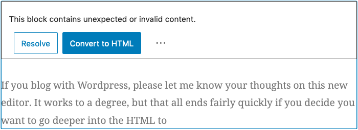
If you blog with WordPress, please let me know your thoughts on this new Gutenberg editor. Yes, it does work to a degree, but that all ends fairly quickly if you decide you want to go deeper into the HTML to style things.
Otherwise, too many times you get the below (note, Classic Block used for the below image as the spacing needed to be styled):
Out of 5 stars, I give Gutenberg a solid 2.2 star rating. I give Calypso a 3.8 star rating. Calypso is simpler, easier to use and overall gets the job done faster. The lower rating for Gutenberg isn’t necessarily because of its failures, but mostly because its design goals didn’t seek to improve the overall WordPress blogging experience or help us making blogging faster. Complexity is a double edged sword and doesn’t always make things “better”. If anything, that’s the primary takeaway from this updated editor’s design.
There are even more usability and ergonomic problems that I simply can’t get into here. You’ll simply have to try it and compare. Though, I’m never a fan of designers who feel the need to place stuff behind increasing layers of menus. If it’s a function that can be front and center, it should be front and center. Placing that thing behind layers and more layers of menus only serves to waste my time.
Launch Speed Benchmarking
Here’s where Gutenberg fails again. The amount of time it takes to launch Gutenberg is excessive. Calypso takes slightly under 2 seconds to completely launch and be ready to edit your article. Unfortunately, it takes almost 10 seconds for Gutenberg to launch before you’re ready to edit. Yeah, that’s a big step backwards in performance. Time is important. Waiting almost 10 seconds for an editor to launch just to make a simple change is a severe waste of time. If you have to do this multiple times in a day, that wasted time adds up.
Gutenberg needs a MAJOR overhaul in the launch performance area.
↩︎


7 comments