WordPress Review: Gutenberg Editor

This will be a no hold’s barred review of using the “new” Gutenberg editor in WordPress.com (and WordPress of any install). Let’s explore.
Calypso
Several years ago, WordPress introduced the then “new” Calypso editor. It had a blue-ish color style and was a straight up type of no-frills editor. It had some flaws, to be sure, but it worked well.
About 2 years ago, along comes the newest new editor named Gutenberg. This editor was thought to be intended as a what-you-see-is-what-you-get (WYSIWYG) editing experience. Well, let me just say straight up and flat out, it isn’t. Yes, this review will be very critical of this editor. I generally refrain from reviewing my blogging platform, but in this instance I felt compelled and justified to review this editor and its massive set of usability and ergonomic flaws.
Gutenberg
Several years ago, the Gutenberg project started. This editor was intended to be the eventual replacement for Calypso. ‘Eventually’ has arrived and the hour for replacement is at hand. Yet, Gutenberg is still not yet prime time ready. It is so far from being prime time ready, I can’t even adequately justify how badly it isn’t ready. Where Calypso had some flaws, these were easily overcome with a small amount of fiddling.
With Gutenberg, fiddling takes minutes at a time (and many times way longer) and sometimes there aren’t even ways to address the problems inherent in this new editor.
Let me start by addressing Gutenberg’s positive features before I get down into the nitty gritty problems with it.
Gutenberg’s Benefits
I want to make sure to cover both the positive and negative sides of the Gutenberg editor so that I’m not called out for unfairly representing this editor. With that said, let’s get going. Gutenberg’s positives include:
- Block editing capabilities
- Some additional text styling options (superscript, subscript, etc)
- Not much else of note.
Block editing is pretty much where Gutenberg’s positives end. Block editing doesn’t greatly enhance the blog editing experience and, at the same time, Gutenberg adds an unnecessary layer of complexity to Calypso’s formerly simple editing design.
What does block editing do for the blogger exactly? It allows you to more easily move blocks around within an article. That’s pretty much its claim to fame. Though, I don’t see how that really buys much when most computers today offer copy and paste capabilities that allow this same functionality through drag, highlight, cut and paste. The fact that they spent gobs of time designing a new editor solely to solve a perceived copy-paste problem (that doesn’t really exist) speaks volumes of this editor’s design goals.
Gutenberg’s Drawbacks
There are many. First, the width of the editor is too narrow. Calypso had an editor width far greater than Gutenberg. This means that Gutenberg is not in any way a WYSIWIG design. Second, you must still preview your document… which in and of itself says that Gutenberg is NOT a WYSIWIG design.
Basically, Gutenberg’s team redesigned an editor for no reason at all. It was simply a new design to be a new design, but not to solve any actual editing problems. In fact, they’ve introduced new problems where in Calypso’s editor they didn’t exist.
For example, the bottom status bar in Calypso showed us the word count and other pertinent document information front and center. We didn’t have to click into or move our mouse to get to this information. Yet, in Gutenberg, this information is now hidden behind an icon that 1) makes no sense and 2) now requires active effort on the part of the blogger.
The block editing system also fairs just about as well (or not, depending on your point of view). There are a number of block types like paragraph, heading and image with an additional array of way lesser used block types like Star Rating, Highlighter, Quote and Pullquote.
As I said, the team has made this editor unnecessarily more complicated without the need to be this complicated. A text editor, in fact, should be much more simple, friendly, fast and easy. Many of these functions were handled in Calypso more elegantly, by highlighting text, then clicking to apply an attribute to that text. Basically, 1-2-3. In Gutenberg, you have to create a new block type by clicking many times, then placing that specific text into that block type.
Whoops! You chose the wrong block type? There’s almost never a way to convert from one to another. You must copy the content out, create a new block, and paste it in. Even then, sometimes copy and paste won’t work.
So, here’s where the block difficulties begin. Because blocks are now discrete elements within the body of the article… think of them as <div></div> sections, it’s difficult to get exact placement. In fact, trying to style any of these blocks using inline CSS is almost impossible. With Calypso, the text was straightforward and could be easily styled within the body of the article. In Gutenberg, if you want complex style options, you’re forced to use the Classic Block, which is effectively most of Calypso in a block. By being forced to use the Classic Block, you’ve pretty much negated the reason to even use Gutenberg in the first place.
That’s not to say you can’t style within Gutenberg, but it’s more about what happens after you do it. When you go into the HTML and muck about with styling of the paragraphs, Gutenberg’s parser typically fails to understand this HTML CSS addition and forces conversion of the entire block into HTML with no more instant preview available. Now you’re stuck viewing this individual block as ugly HTML forever. If you want to see what it will look like in the actual article, you must click ‘Preview’. Calypso happily and fully rendered in-line CSS and still allowed a preview. It never once balked at adding in-line CSS, though it might strip it out if it didn’t like what you did. This is one of Gutenberg’s biggest failures. Blogging is driven by HTML. Styling HTML with CSS is probably one of the simplest things you can do… yet Gutenberg can’t even understand simple CSS styling? Yeah, that’s a #fail.
For styling images and placing them in very specific locations within Gutenberg block articles, here’s where Gutenberg again fails. While you can create an image block and it auto-wraps text, there is no exact placement or altering margins of white space around the image block within Gutenberg. If you want exact placement or specific spacing for the text wrapping around your image, you must again revert to using the Classic Block. Again, another of Gutenberg’s failures.
If you’re going to spend time creating a complex block editing system, you’d think that exact placement of blocks in space within the document (i.e., drag and drop) would have been part of the design. Unfortunately, you’d have thought wrong because this aspect of Gutenberg simply doesn’t exist. There is no drag and drop or exact placement here.
What exactly is Gutenberg then?
That’s what I keep asking myself. Reinventing the wheel without actually offering us something new, improved and innovative is a questionable design choice. In fact, because of the overreaching complexity introduced by Gutenberg into a platform that should be all about simplicity is, again, questionable. WordPress has always been about making it easy and simple to blog. This convoluted, complex and difficult to manage editor only serves to make the blogging experience more difficult, not easier.
I’m not saying Calypso is a perfect editor by any stretch. Hardly. Calypso has a fair number of problems that also need to be addressed. Unfortunately, that editor’s updates had been abandoned about to the time the Gutenberg team started up. This left Calypso mostly unfinished, yet still reasonably simple to use and definitely easier to manage an article’s overall content.
Complexity
I keep talking about unnecessary complexity. Let me expound on that. Part of the complexity of Gutenberg stems from the block system itself. The fact that we now have to select a specific block type, not really knowing what each do in advance, means we now have to understand the block’s features and their usefulness. That means trial and error. That means a learning curve. That also means needing to understand the limitations of this new unfriendlier editing system.
Yes, it goes deeper than this. The blocks themselves, as I said, are discrete separate entities. You can’t embed one block within another. For example, you can’t make a block quote show up word wrapped next to basic text within your article. An example of a block quote block type is immediately below:
This is a block quote
forces a citation
Unfortunately, a block quote must sit in that position where it is. It can’t be moved into a wrapped position within another block (like an image). You’d think that this kind of innovation would be possible in a new editor. Unfortunately, no. Worse, as you’ll notice, this paragraph is too closely abutted next to the block quote. With Gutenberg, you can’t fix this horrible spacing issue. There’s no way without using inline CSS styling. If you attempt to use inline CSS styling, the entire block may be forced into HTML mode leaving no way to preview the block in the editor.
Now begins a Classic Block.
This is a block quote
The block quote in the classic block doesn’t force a citation footer, leaving much more white space without leaving this paragraph feeling so cramped. Remember, white space is your friend.
Let’s talk about images and placement
To place an image using Gutenberg, this is what you get. You can align left, center or right.

Here is a paragraph next to an image using blocks. You can word wrap next to an image, but you can’t change the spacing of the text around the image.
In a Classic Block, I can style the image to add margin-left and margin-right to change the spacing next to the words. I can’t do this in Gutenberg’s blocks.
Unfortunately, using Gutenberg to perform image wrapping has some unnecessary complexities. There’s no way to ensure that the block just below it is separate. Instead, it wants to pull up and wrap that block too. There’s no way to make sure that the block just below the image doesn’t wrap. Gutenberg attempts to wrap everything. With Calypso, this editor has more fine grained control over this problem because you can add HTML pieces that enforce this.
 Here begins a Classic Block with some text and an image. I’m writing just enough text here so that I can insert an image and do word wrapping around the image. Keep in mind that a classic block is basically Calypso in a block.
As you can see, this image has more space to the right of it. I styled this image with a margin-right CSS tag which is impossible to achieve using a Gutenberg image block.
Importing Older Articles
If you’ve used Calypso to write articles in the past in WordPress, you may find that Gutenberg’s importing system to be questionable, if not downright problematic. If you attempt to convert a Calypso written article into Gutenberg blocks, expect failure and LOTS of re-editing. Yeah, it can be that bad. Though, it can import without problems too. It all depends on the article’s content. Importing a Calypso document into a Classic Block has much more likelihood of succeeding… after all, the Classic Block is pretty much compatible to Calypso.
There may be instances where importing an older article may not work in either the Classic Block or as Gutenberg blocks. Basically, you take your chances when attempting to edit older articles within Gutenberg. Most times it works, but it may mangle portions of your article’s spacing and other attributes that may see you spending time re-editing. You’ll want to be sure to scrub your article from top to bottom if you attempt to import an older article into Gutenberg. You may find your formatting has been stripped or other features become unavailable.
Gutenberg not Prime Time Ready
The problem with Gutenberg is that there are so many small nuances that are ergonomically incorrect, flat out wrong or of bad design that using it to blog can easily turn into a lengthy chore. While I did use Gutenberg to craft this article, it wasn’t by any means easy to achieve. I did run into quite a number of problems. For example, there’s a Gutenberg open bug report that prevents editing any block’s HTML without crashing the editor entirely. This means that once you edit HTML, the menu that allows you to convert back to visual editing disappears entirely.
You are then forced to quit entirely out of the editor back to the WordPress posts area, then re-edit the article again by relaunching the editor. The Gutenberg team is aware, but it is as yet unfixed.
The small floating menu that appears above the block when selected is problematic. Not only is it the same color as the editor itself (white) the imagery used on the icons is questionable, with none of the images looking professionally designed. In fact, it looks like someone hired their teen art student kid to design the images. They’re not only too simplistic and basic, many don’t read as to the function they perform. This whole area needs an overhaul… from the questionable floating menu to the coloring to the icon imagery. It’s awful and amateur.
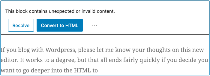
If you blog with WordPress, please let me know your thoughts on this new Gutenberg editor. Yes, it does work to a degree, but that all ends fairly quickly if you decide you want to go deeper into the HTML to style things.
Otherwise, too many times you get the below (note, Classic Block used for the below image as the spacing needed to be styled):
Out of 5 stars, I give Gutenberg a solid 2.2 star rating. I give Calypso a 3.8 star rating. Calypso is simpler, easier to use and overall gets the job done faster. The lower rating for Gutenberg isn’t necessarily because of its failures, but mostly because its design goals didn’t seek to improve the overall WordPress blogging experience or help us making blogging faster. Complexity is a double edged sword and doesn’t always make things “better”. If anything, that’s the primary takeaway from this updated editor’s design.
There are even more usability and ergonomic problems that I simply can’t get into here. You’ll simply have to try it and compare. Though, I’m never a fan of designers who feel the need to place stuff behind increasing layers of menus. If it’s a function that can be front and center, it should be front and center. Placing that thing behind layers and more layers of menus only serves to waste my time.
Launch Speed Benchmarking
Here’s where Gutenberg fails again. The amount of time it takes to launch Gutenberg is excessive. Calypso takes slightly under 2 seconds to completely launch and be ready to edit your article. Unfortunately, it takes almost 10 seconds for Gutenberg to launch before you’re ready to edit. Yeah, that’s a big step backwards in performance. Time is important. Waiting almost 10 seconds for an editor to launch just to make a simple change is a severe waste of time. If you have to do this multiple times in a day, that wasted time adds up.
Gutenberg needs a MAJOR overhaul in the launch performance area.
↩︎


leave a comment