IOS7: The New Android?
Note, apparently some readers think I do a lot of ranting. Sometimes I do. In this case, you better get prepared for a rant of epic proportions because here it comes.
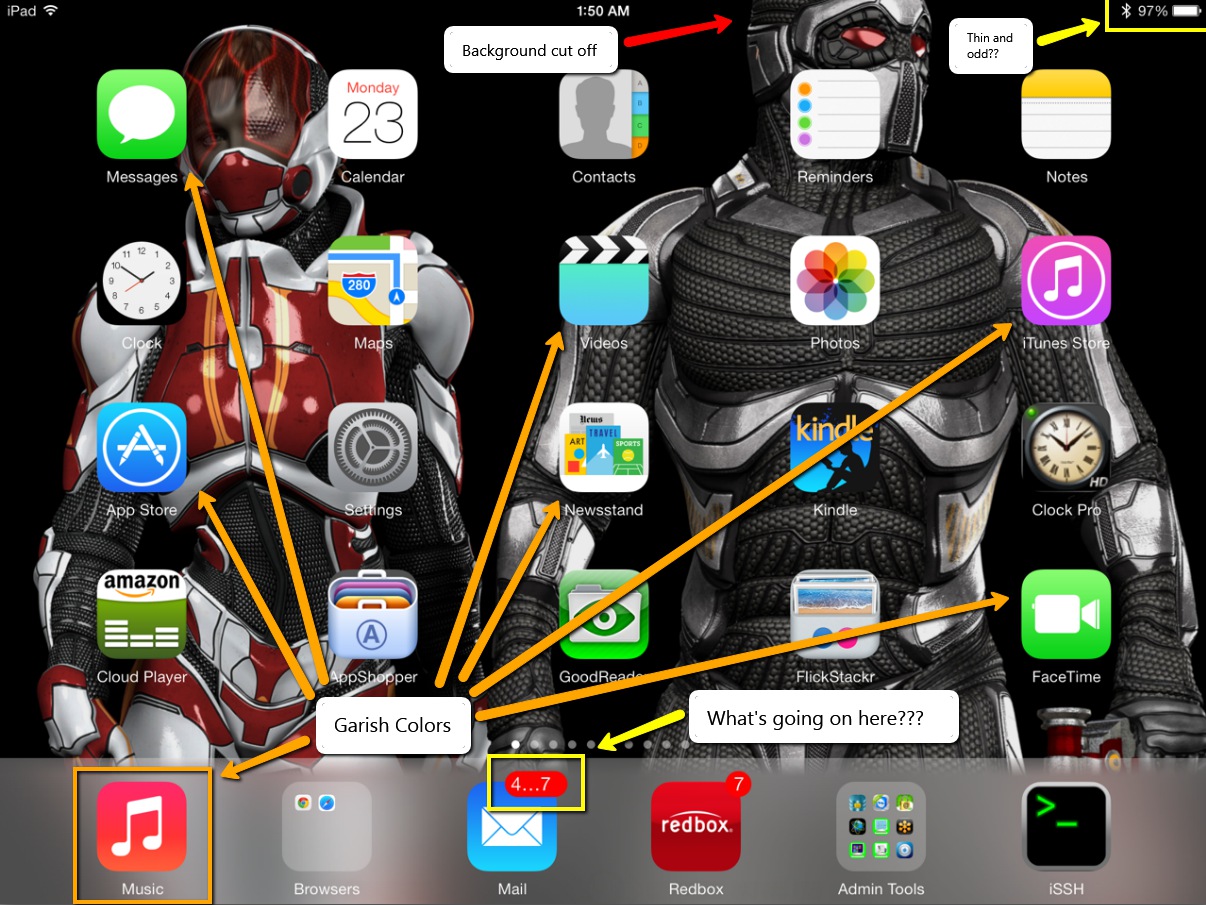
White screens and borders, really?

Ok, so when I flipped open my iPad the first time on IOS7, I’m greeted by white screens (or nearly white screens). At first I wasn’t sure to make of it. Now, I’m quite sure. The white screens must go. If you’re trying to use the iPad in the dark, it’s like having a flashlight shining in your face. No, thanks.
Not only are the white screens extremely distracting, they’re hard on the eyes and there’s nothing quite like staring at the end of a flashlight when you’re sitting in the dark. No, bad idea. Worse, whatever happened to the light sensor? Come on Apple. You put the sensor on the unit, use the damned thing will you? If I’m in a low light environment, choose a background that complements the low light environment. If I’m in a high light environment, again, choose a brighter background to make the contrast stand out. I don’t need to be blinded in the dark and I don’t want to see a washed out screen when it’s bright outside.
Gag! the Calendar app has that white background with red letters by default. Red? Really?!? I may have to rethink my Calendaring again.Whatever happened to all of that great engineering that used to work at Apple? I think they’ve all gone to Android. Let’s put some thinking caps on shall we?
What’s worse than white screens?
I’ll answer that question.. It’s when the OS flips back and forth between black and white screens. So, now not only do you have blinding white screens with garish colored fonts staring you in the face, now iOS has to flip between the solid white screens to solid black screens. Sure, there’s this fade transition thing, but it’s still overbearing and unnecessary. This is, in my estimation, one of the absolute worst design practices I’ve ever seen from any company. Who would ever design any application where one screen is almost solid white and the next is almost solid black. This is the absolute antithesis of good design. No graphical designer of any merit would even hint at let alone pitch such a stark transition between two elements.
An OS should be about experiences that let you get your work done. Not experiences that distract you from that purpose. If anything, the OS should blend into the background and facilitate getting the work done. Instead, the OS practically waving a red flag in your face and saying, “Here, look at me”.
Photos App is absolutely broken

When you’re just viewing photos, there’s this annoying white bar at the top of the screen that covers over the top 10% of the image. What’s that all about? I mean, can’t Apple software engineers figure out how to properly scale an image so it can be fully visible on the screen without being covered over by menu bars?
If you try to set wallpaper with the Photos app by scaling or sizing an image, be prepared for the whole app to lock up and possibly even cause your whole iPad to spontaneously reboot. This app is seriously unstable. Was this software even remotely beta tested? Once again, come on Apple. I can understand if something like Bob’s app was borked up, but the Photos app is pretty much a necessity. This has to be fixed and pronto.
And, to top it off, when you can manage to get the app not to lock the whole blasted iPad up when moving and scaling, it pushes 30% of the image off the top of the screen with no way to correct it. What crap!
Background Image movement effect
That new live motion background thing is the most worthless use of extra CPU cycles I’ve seen yet. The short and sweet of it is, let me turn it off. Don’t care about, don’t want it, don’t need it. And, the affect is so small it’s just pointless. I move my iPad 10 inches back and forth and the background moves maybe 1 pixel. Stupid waste of resources.
Lock and Unlock sounds no longer work.
Nuff said. [UPDATE] I kind of figured this one out. After the update to iOS7, these sounds are inexplicably disabled. However, if you go into the Sounds area in settings, you can turn it off and back on. This at least enables the lock sound. It does appear, though, that Apple has stripped the unlock sound from the system.
Carnival Colors
Where are we, Google? Seriously. I don’t want garish colors shining in my face at practically every turn. Some of the colors are almost like fluorescent green colors. It’s like, bad and ugly all at the same time. I don’t mind the flat look, but these colors seriously need to be muted down a whole lot.
Android Clone
Apple just ripped a page out of the Android book with IOS7, especially when it comes to the so-called streamlined fonts. This OS looks and feels more like Android than any other OS I’ve seen. We already have an Android. We don’t need another one. Do something original Apple. After all, that’s what you used to be known for. If I wanted to buy an Android tablet, I’d go buy one. I don’t want my Apple product to look and feel like an Android tablet. Of course, now we just need to wait for Google to file a lawsuit against Apple.
I’m hoping that Apple can get this quickly derailing train back on track soon with 7.0.1 as this thing called IOS7 is a hot mess. … and I thought IOS6 was bad.


leave a comment